Design Elements Overview
Overview
Affino Responsive Design Centre is currently in Advanced Beta, it was launched in its first phase of Beta more than two years ago for the Angry Birds website, which went live in April 2014. Since then we have run through 6 further iterations, meaning that Responsive Design Centre is currently in Beta V7. Being in Beta means that the actual Look and Feel of Responsive Design Centre is not in its final livery, and that a number of Design Elements still remain to be transitioned across from Classic (Adaptive) Affino.
The purpose of this guide is to highlight which Design Elements are the ones your should be utlitising.
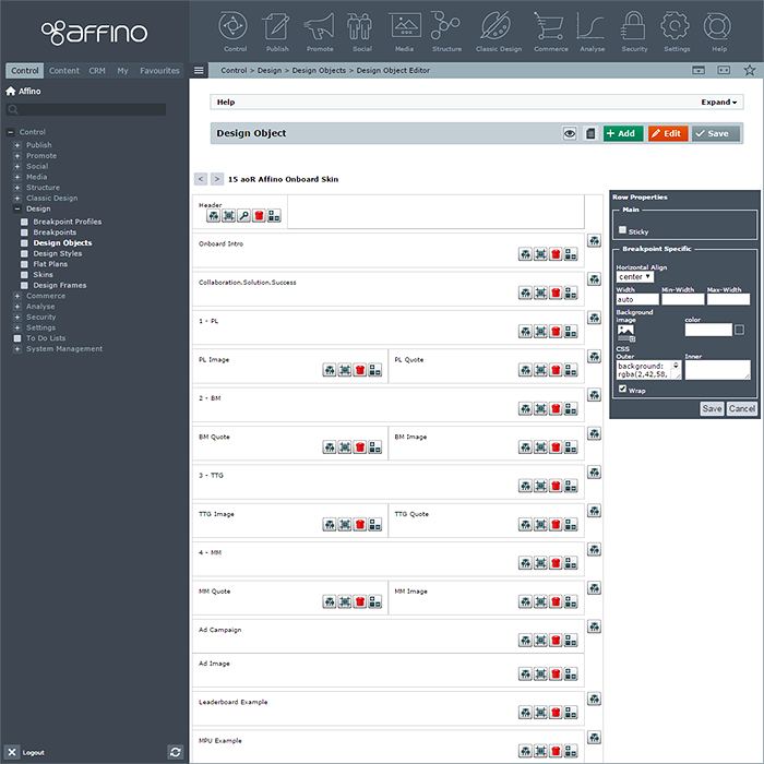
When you construct your Design Objects, and come to select Cell Content, you currently get a drop-down list of 22 (21 more are still in development):
- Article Carousel
- Article Feature Scroller *
- Article Listing
- Auto-Related Content *
- Blog Navigation *
- Campaign Placement Area
- Channel Details *
- Feature Scroller *
- Image
- Job Listing
- Levels
- Login *
- Media Listing
- Online Form *
- Prime Content
- Prime Content Navigation *
- Prime Related Content *
- Recruitment Search
- Shopping Basket
- Search *
- Smart Button
- Smart Text
NOTE - those indicated with * asterisk are first stage iterations which will be updatded to V7 format in the very near future
Article Carousel
This is used mostly for rotating logos on site footers - for sponsors typically or partners. You select an Article, often a Link type Article and select whether to display Name, image type etc. with a large number of settings to define exactly what appears and in what configuration, including a Break Point Item Grid and Ecommerce attributes too.
Article Feature Scroller *
A hybrid Feature Scroller using Articles as the display elements - selecting different title and text elements and combining with selected Article Imagery and settings including Max Width, Content Container Position and Slide Effect. Gives you a more dynamic Feature Scroller which is also easy to add to and update.
Article Listing
The main element on Gateway Pages - now with myriad display options which make older 'Panel Design Element' redundant. You simply select Article Section and configure numerous settings and display parameters. Every Affino site uses these in abundance.
Auto Related Content *
Automatic Related Panel based on Topic / Keyword Associations - such that this elements scans the Prime Content Area, and matches relevant Articles by way of common Topic Assignment.
Blog Navigation *
As can be seen on the Affino.com Blog, this element display a 4-tabbed panel with - Latest | Popular | Tags | Comments. There are some settings to configure the display, but most of the content is displayed automatically via functionality for each tab.
Campaign Placement Area
The allocation of numbered 1-7 Campaign Slots which marry up and map over Campaign Themes to display banners in various places of the Design Object / Skin.
Channel Detail *
This panel element allows you to pull out Title from a Channel, and display alongside either Thumbnail, Header Image, Name, Teaser or Channel Detail Text.
Feature Scroller *
Media Library Section -based Hero Panel (so only text visible will be part of Image). You can select Slide Effect and duration, alongside navigation elements.
Image
Most Basic of Design Elements - simply select Image and MouseOver Image with Alt and Link and fix Image dimensions in pixels or percentages.
Job Listing
Affino's Recruitment Brief Listing - like a heavily slimmed down Article Listing with relatively very few settings - Number of Jobs and Sponsored Jobs to be displayed, and how Topic filters are applied.
Levels
Affino's Cookie Crumb element - Separator Type, Text or Icon and a handful of styling settings - font and colours through from Design Style applied to Cell.
Login *
Basic Login Design panel with Vertical and Horizontal layout options, Login Form Title and options to include links for Password Reminder and Registration, the rest - in particular Form Style comes from the Design Style applied to Cell.
Media Listing
Select Media Library and arrange items in Rows and Columns, various display and layout options for pop-up lightbox, media type filter and Ecommerce settings for purchase and download.
Online Form *
Ability to display simple Affino Forms on Gateway Pages as Selected Online Forms, or in right hand Column of Design Object / Skin with 'Show Related Form' option ticked - as a fully displayed related Online Form.
Prime Content
This is the essential dynamic display area - which pulls through native content on those Live Channels - whether Articles, Media, Login Form or Search - Channel Type determines content type and functionality, but they all need to be displayed through Prime Content Area Design Element. Includes settings like 'Show Secured Content', 'Hide Comments & Ratings' nad 'Hide AltMain Text'.
Prime Content Navigation *
This utilises the Main List Section / Item settings on Section - or the opposite really, as Items or Sections not Main-listed appear in the Prime Content Navigation - whose main purpose is to list other content in Section, so you don't have to keep navigating back to the top of the content tree to view more articles.
Prime Related Content *
A Key Affino Design Element which related up to 20 different types of content and lits them usually in this right hand panel. Note that not all Content Types have been transitioned across from Classic yet, so not all related content types can display right now. We usually roll out more types per installation, as and when required.
Recruitment Search
AKA Job Search - A smallish Search Panel based on Selected Recruitment Briefs Channel, Recruitment Sectors, Country and Regions.
Search *
[_________] Search - box leading to Site Search Channel - allows users to enter search queries on every page. Usually located top right of screen.
Shopping Basket
Ecommerce Design Element which displays Shopping Basket Icon alongside number of items in basket - with settings for Quantity and Notification Text and Background Colours.
Smart Button
Top Navigation Button Design Element - with dynamic Section Tree Focus and a variety of Auto Links for smart user access to key utilities.
Smart Text
Smart Auto Text in the form of Date and Time Stamps and salutations and the option to simply enter static text panel.
Did you find this content useful?
Thank you for your input
Thank you for your feedback
Meetings:
Google Meet and Zoom
Venue:
Soho House, Soho Works +
Registered Office:
55 Bathurst Mews
London, UK
W2 2SB
© Affino 2024
