Affino Beta Labs - Live Editor Updates
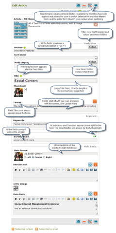
We’re very excited about the enhancements we’ve made to media uploads and selection in the next release. The whole process is fast and simple. The improvements are so dramatic that we decided to look at the whole Live Editor interface and see if we could make it more intuitive and more contemporary.
We’ve had a lot of conversations internally and externally over the years about the form of the Live Editor. We’ve also tried out lots of interfaces which frequently look great on the surface, but as soon as you actually need to use them, they turn out very clunky.
The typical examples of ’modern’ publishing interfaces mean that you click on some text and it flips into a form entry field. This looks great, but you tend to get bogged down as soon as you go beyond the basic on-page text and images. Where things fall down rapidly are when you need to:
- Schedule the publish start and end for fixed points in the future
- Add in Meta Data
- Enter the navigation elements, e.g. thumbnail and teaser
- Manage the SEO / URL data
- Setting Geo Blocking
- Applying Security
- etc. etc.
- Some fields are too short, some too long
- The form is stretched where it doesn’t need to be
- The presentation is a bit messy, field lengths inconsistent
- Too much information in the same space, not enough distinction
- Entry fields are not as obvious as they should have been
- Not enough focus on the Title
- And of course overly complex image uploading and selection

Did you find this content useful?
Thank you for your input
Thank you for your feedback
Upcoming and Former Events
Affino Innovation Briefing 2024
Webinar - Introduction to Affino's Expert AI Solutions - Session #2
Webinar - Introduction to Affino's Expert AI Solutions - Session #1
PPA Independent Publisher Conference and Awards 2023
Meetings:
Google Meet and Zoom
Venue:
Soho House, Soho Works +
Registered Office:
55 Bathurst Mews
London, UK
W2 2SB
© Affino 2024
