Analysis Evolved
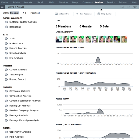
The Analysis Centre in Affino has undergone a continuous evolution since we originally launched the very first version. Every single Analysis screen has seen two or more updates over the past year, some have seen dozens.
Recently we’ve accelerated the evolution considerably as technologies firm up and we’re able to roll out much smarter, more immediate analytics interfaces.
Previously a great deal of our focus was on the Dashboards, we found that in practice very few users ended up configuring these, instead preferring to use more basic tools which needed less effort.
It means that we’re now focusing more on ready-made stats interfaces which are optimised right from the outset to give you the best views of immediate activities whilst also giving you insight into long-term trends.
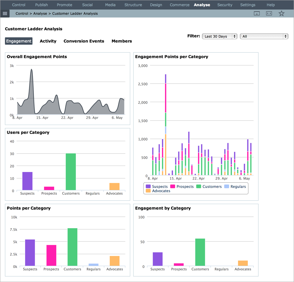
The one exception is the Customer Ladder in which all the metrics are customised by you, far beyond what was possible with the Dashboard.
Data Crunching
Besides the death of Flash, and the impact that had on most dynamic online analysis tools, we found that Affino collected too much data, too easily. On the surface it’s great to capture and retain every data point, but very quickly this incidental data starts to weigh down on performance and drive up costs.
We believe we now have the mix just about right by extending the data series to two years, and we’ll scale up from here. We have done this by doing a great deal of data crunching.
Aggregating data continuously to provide daily, weekly and monthly overviews essential for long term trends, cleaning up the millions of un-used underlying data points.
At the same time we’re also providing better insight into Now and the most recent trends.
Updated Analysis Centre
When you go to the Analysis Centre there is now an instant overview of the activity on your site, with live updates of how many members, guests and bots are on-site along with the latest activity. There’s also handy snapshots of the overall level of user engagement for the day and recent past.
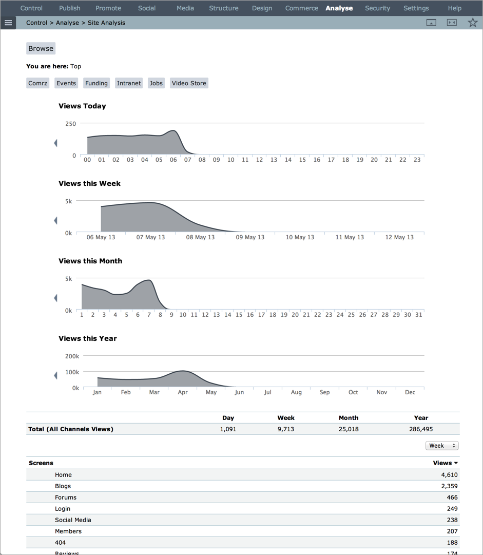
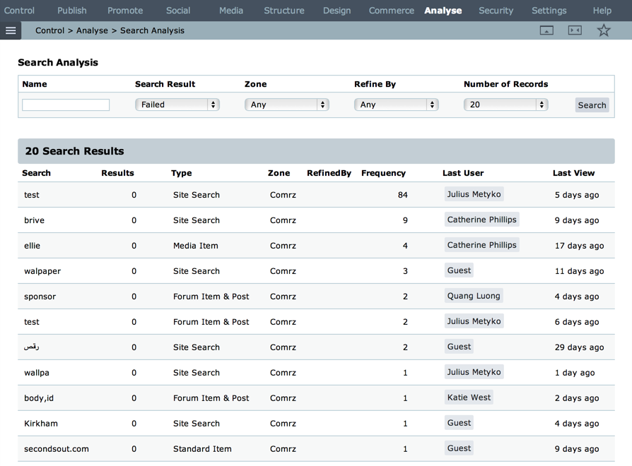
The Analysis Centre itself is now organised into categories so that for example all the Promotional analysis tools are grouped. When you go into each analysis screen, you will notice that many are now much faster than previously. A great example of this is the Site Analysis
Updated Analysis Tools
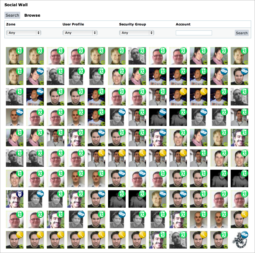
It’s not every day we add completely new tools to the Analysis Centre, but we’ve launched three new ones in the last release in Message Campaign and Mailing List Analysis (see separate post here) and a great Social Wall which shows you the latest activity on your site.
Customer Ladder Analysis, Campaign Analysis, Audit, Message, Site and Search Analysis have all had big updates and are considerably more effective.
Better Stats vs Bots
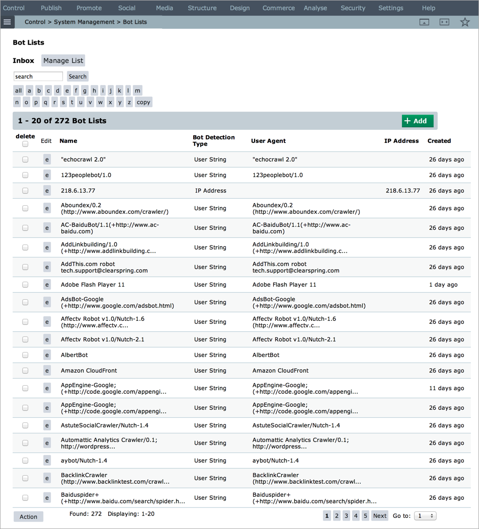
One thing that gets in the way of great stats is Bots. Good bots are essential for the running of the net, e.g. Google Search bot, but malicious bots just adversely affect performance and any stats that are gathered.
We’ve always made a distinction between member access, guests and bots. Where traditionally there was a lag was in bot tracking in Affino, that all changed in Affino 7.1 which now has great Bot detection and we automatically distribute new bot lists to all Affino sites daily to reflect the latest bots detected across all Affino sites. This means much more accurate stats moving ahead.
Instant Access
Another shift we’ve made with the Analytics is that we now provide much closer links between content and analysis. It is possible to see instantly the headline counts for messages whilst managing messages. It is also possible to directly link into the relevant filtered analytics for the message, same goes for message campaigns, mailing lists, campaign creatives, conversion events and much more.
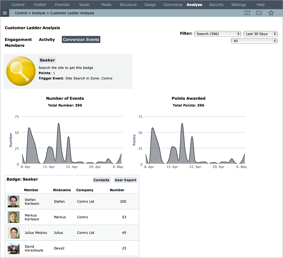
We’re just starting with this, in the future it will be possible to click directly to relevant stats on pretty much any content / user / campaign you’re running.
Second Life for Dashboard
Although the Dashboard v1 is on the way out of Affino, along with all the other Flash / Flex elements, it has now gained a renewed purpose with big performance improvements and much longer timeframes in the latest release.
We’ve also improved considerably the quality of much of the data and it’s a great way to identify the most popular parts, and productive members on a website at a glance.
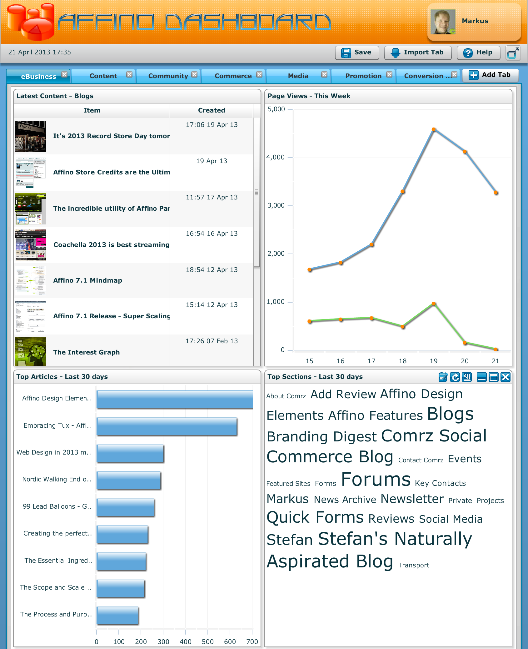
Page Dashboards are now also very useful again for at-a-glance overviews of how any page is performing.
User and Account Analysis
Outside of the Analysis Centre the most significant Analysis tools are found in Account and Contact management. You can go to the Analysis tab and get a great deal of insight into the level of engagement of each member of your community.
It combines many of the analytics tools onto a single screen, which is entirely focused on the individual, or in the case of Accounts, all the individuals within that account.
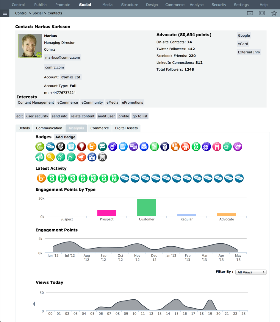
We have made this much more an effective tool over the past few releases, so you now have great insight into your user activity stream and engagement level.

Did you find this content useful?
Thank you for your input
Thank you for your feedback
Upcoming and Former Events
Affino Innovation Briefing 2024
Webinar - Introduction to Affino's Expert AI Solutions - Session #2
Webinar - Introduction to Affino's Expert AI Solutions - Session #1
PPA Independent Publisher Conference and Awards 2023
Meetings:
Google Meet and Zoom
Venue:
Soho House, Soho Works +
Registered Office:
55 Bathurst Mews
London, UK
W2 2SB
© Affino 2024


