BBC News takes a step back in going forward

As anyone who knows me will attest, I am a huge fan of the BBC family of websites generally, and in the past have often referenced parts of the BBC Site in terms of best practice implementation for certain functionality and interfaces.
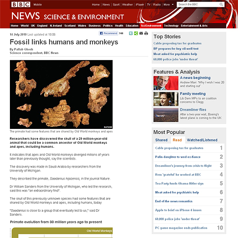
However! In my opinion, the new design of the BBC News pages takes them back significantly in terms of best practice usability. The BBC has adopted a ’Blog’ style format, dispensing with the contextual left-hand Main Menu, and instead rendering a more simplified version of this at the top of the page.
Moreover, Related Content used to be located in the right-hand column, but is now placed at the very bottom of the article. The sole purpose of the right hand column now is for general Content Highlights, even this is a little backward, as the numbering of the Most Popular articles comes to the right of the titles.
I would sincerely love to see the Usability Testing Results on this new layout, as any idea of cross-contextual browsing is completely lost in the new format. In our many years of experience, the best format for informatic sites is 3 columns - with pertinent references aligning up alongside the main article - to the right and and left. In removing the contextual basis of the page location with the simplified Menu, it is more difficult to contextually navigate to related content. The Main Menu itself could be improved with the addition of additional drop-downs. As for the loss of the Related Items from the right hand panel, I cannot see why this has been done - humans always reference best in the same plane of view - this is why you have margin notes. Moving everything to the base of the page divorces the primary content from its contextual relativity, and reduces browsing to linear terms, rather than the tangential / parallel means we have grown accustomed to.
The new layout is definitely more elegant, and the BBC have updated the various Article Tools (share etc.) to a nicer format, but for me, the whole usability has gone back enormously.
What do you think?

Did you find this content useful?
Thank you for your input
Thank you for your feedback
Upcoming and Former Events
Affino Innovation Briefing 2024
Webinar - Introduction to Affino's Expert AI Solutions - Session #2
Webinar - Introduction to Affino's Expert AI Solutions - Session #1
PPA Independent Publisher Conference and Awards 2023
Meetings:
Google Meet and Zoom
Venue:
Soho House, Soho Works +
Registered Office:
55 Bathurst Mews
London, UK
W2 2SB
© Affino 2024


