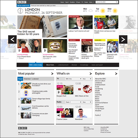
New BBC Homepage Design has several drawbacks

I can totally see what the BBC is trying to achieve with their New Home Page Design, and largely I applaud their efforts, but not necessarily the results. All of us Web Professionals know that there is always a trade-off between functionality, usability and aethetics. With the acceletared rate of tablet uptake, particularly ’iPads’, we are seeing more and more tablet-style navigations as part of generic website design. Gone is the old-fashioned paging of the traditional internet screens, to be replaced by horizontally swiped pages and infinite vertical scrolling - I have a feeling eBooks will soon have infinite vertical scrolling too - even an automated setting which allow the text to trickle up the page at your pace of reading.
The fundamentals in any interface design though remain the same - focusing and guiding the user through the key information display areas / panels - in a co-ordinated order of hierarchy and prominence. And in the area of information architecture and relative prominence of content highlights, the balance is far from right.
The new above the line design is kind of like a Magazine template - mostly with single item feature tiles - and there is too little difference between the many blocks / tiles to focus the user’s eye properly on a set order of tasks. We then have the more typical Web Content Listing Highlights below the line as it were - Most Popular > What’s On > Explore >.
In the process, we have lost a significant part of the former’s information overview - there are actually far fewer items of content displayed on the screen at any one time, and in a harder-to-read format.
Several of the panels I really like on the current one are missing too - History Highlights are gone, as is the iPlayer Highlights scroller, the Music Highlights etc. etc. What we have as a replacement is much less flexible in its structure and offers content up largely in a less hierarchical fashion.
My neat pockets of information have disappeared - to be replaced by swiped masthead overviews of amorphous blocks which seem somewhat randomly arranged - you get a tile here and there corresponding with the ’Music’ topic, but rarely in the same place twice.
It’s pretty for sure, and zippy to use, but in terms of information retrieval / transparency / discoverability and reproducability it all leaves you feeling somewhat underwhelmed - a typical triumph of style over substance. Newspapers have their tightly regulated columns - and set positions, yet here we have something entirely more random - like a lucky-draw of content in some ways, with never the same combination.
There are some nice features, and the overall navigation is slick and effortless, it’s just that we have lost too much of the utility and depth of the former version. This is very much a case of 1 step forward, but 2 steps back...

Did you find this content useful?
Thank you for your input
Thank you for your feedback
Upcoming and Former Events
Affino Innovation Briefing 2024
Webinar - Introduction to Affino's Expert AI Solutions - Session #2
Webinar - Introduction to Affino's Expert AI Solutions - Session #1
PPA Independent Publisher Conference and Awards 2023
Meetings:
Google Meet and Zoom
Venue:
Soho House, Soho Works +
Registered Office:
55 Bathurst Mews
London, UK
W2 2SB
© Affino 2024


