Using Scientific Principles in Design and Branding

A big part of our daily operation involves design - designing logos, icons, screens, applications, infographics and interfaces. We spend many hours browsing through image, video, sound and font libraries - all in pursuit of the best possible results. The trickiest thing about design though is the language of communication and reference, maintaining objectivity and overcoming the challenges of singular perspective and personal bias. There is a subjective component to design for sure, but we try to reduce its impact to the minimum, so that the end results can be properly weighed up and judged by all.
When I worked in advertising, I quickly realised the importance of a good brief - this is essential for efficient management of resources, reducing wastage and actually achieving the right result. For each design task, there are a thousand different paths that can be taken, but only a few will yield the optimal outcome. This is proper ’applied design’ which I often term as ’results-oriented-design’. Another of my essential lessons from advertising is that every marketing asset / deliverable should have a measurable function - usually some sort of call to action / call and response.
The difficulty most people have with design is threefold - consolidating and organising their ideas coherently; separating their own subjectivity and bias out of the mix - so that they can tackle the brief wholly objectively and from their customers’ perspective; and thirdly - how best to communicate requirements clearly and without obfuscation (confusion!) ... which leads me nicely into automotive, cake and housing analogies.
Automobiles, Cakes and Houses
Before you design anything, you really need a clear idea of exactly what you are looking to achieve with the design. In advertising, we often used car analogies, and I will explain some of those approaches here. First we will talk about cakes! - think of the design brief as being a collection of ingredients which you need to bake your metaphorical cake - however, unless you know what kind of cake you are aiming to bake - i.e. have a proper recipe, a list of disparate ingredients on their own simply cannot work - you need the recipe first before you start mixing up the ingredients or the results will be less than palatable.
In terms of Cars - I always say that buying a car is a great analogy for creative briefing, as you need to decide on various factors - like how many passengers need to be accommodated, fuel economy, general performance factors, comfort, ICE, and additional requirements like 4x4 / off-road abilities. Some of the initial briefs we have received have had very contrasting references, which I try to equate with being sent to a showroom to buy a specific car with very mixed-up requirements: It is quite evident that a two-seater sportster and a 7-seater MPV / SUV are pretty much at the opposite ends of the spectrum, but you often get briefs which are essentially asking for a similar outré combination - trying to group together elements which simply aren’t compatible. One of the key provisos of design briefs therefore is that the aims must at least be practically achievable.
The design process behind building a website or digital business is not so different from designing a house. You need to consider overall wiring, plumbing and amenities, how many rooms and how many floors, but then each room typically has a specific function and own specific requirements. Much in the same way different screens of a website or digital business interface fall into specific hierarchies and each needs to convey different content and function, and needs to be wired and plumbed together in its own way to work smartly with the whole. Getting both plans right at the start means you can build with a degree of flexibility and integrity - this does not mean that the project won’t be iterative, it just significantly saves on the number of times you need to go back to the drawing board and helps guarantee a successful outcome.
Detangling and Streamlining
As I mentioned in the previous section - briefs almost always need significant ’noise reduction’ and filtering at the start. When we design logos, we always start in monochrome - to reduce any degree of bias, so that the iconography has to stand up on its own raw merits. Too many modern logos don’t go through the proper scientific rigour and end up much compromised as a result. A well-designed logo should be able to take on various colours, tones and textures and be scaled liberally in both directions. Yet so many contemporary logos don’t work without their default texture, colour or shading. Successful design should really encapsulate the following 3 key characteristics:
Unique + Meaningful + Memorable
In an increasingly crowded global marketplace, it goes without saying that you really need to stand out in order to get any sort of traction. ’Unique’ here though is not mutually exclusive, as it has to mean something to its intended target audience. A great logo needs to carry personality and values which mean something for and strike an accord with likely consumers. If your logo is Unique and Meaningful, it is likely Memorable as well - so that regular customers can easily recall the logo without prompting.
The Narrative
Humans are fascinated by stories - myths, legends, histories, biographies and fiction. The best stories have universal appeal - which is why pretty much every top-shelf alcohol brand has some sort of story to reinforce prestige and pedigree and connect further with its consumer audience. We have mentioned personality and brand values before, and the brand stories add yet another layer to help the brand / logo become still more meaningful and memorable. Just look at all the different makes of Rum and their typical connection to the Caribbean as well as a frequent association with the more romantic side of piracy - these play into consumers’ imaginations and can elevate otherwise fairly ordinary products to aspirational lifestyle brands with loyal followings.
Brand Profiling and Personality
Matchmaking is at the heart of most marketing - matching up consumers with ideal products and services and vice versa. To appeal to a particular consumer, you need to cater to their belief systems, values and aspirations, as well as hit them with the correct aesthetic. To pitch for certain personalities, your products, services and brandmarks need the correct complementary personalities of their own. At Affino, we do a highly detailed Brand Profile process to help establish the right personality markers to appeal to the intended target audience.
Affino’s Brand Profile process consists of several steps which cover the values, narrative and personality characteristics required to serve a particular purpose. It is wholly a collaboration, as the Client should have better first-hand experience of the end consumer and what their desires and foibles are liable to be. From our side, a big part of this is simply filtering out the noise and the red herrings, and removing any markers which don’t serve the right purpose. We aim to build a fairly detailed profile of the median / typical consumer for that product / brand / service, and match that with the most attractive brand personality.
References and Brand Relatives
When targeting your consumer audience, you really have to consider the environment they inhabit - their entire ecosystem - both at work and at leisure. Which brands are complementary to yours, which are competitors, and just as importantly - which ones you don’t want any connection to. Very little in design is entirely new these days, as pretty much everything has been done before. Certain brands have captured very particular colours, textures and aesthetics, and if your own designs infringe upon these in any way, you are likely to get very mixed results, as the competing brand’s influence will project likely conflicting values and markers onto what you are trying to achieve. Hence Uniqueness is very important as is associative symbolism.
Negative influences we determine as ’whatnots’ and you must eliminate any trace of these from the process. Whatever you design, has to be fully compatible with the existing lifestyle of your target audience. You should be able to do a mood-board of complementary brands - aesthetic and otherwise, and your newly designed asset should fit perfectly onto that same board. You can think of it as a broader family of brands or products. Apple does a very similar exercise every time it originates a new product - laying it out on the family tree to ensure that its aesthetics are wholly in line with Apple’s other offerings.
Applied Art vs Pure Art
All the design we’ve talked about here is design with a purpose = Applied Art. The functional element - in terms of higher level value references, actual usability and call-to-action are as important as how this thing actually looks. Pure Art’s only concern by contrast is the aesthetic and emotional context - it has no follow-on functional value at all. There are plenty of beautifully designed objects in the world which have no purpose beyond being objets d’art. While the applied art usually has a healthy persuasive requirement - particularly in the context of totally new brands. A new logo has to try to win over the intended consumer as quickly as possible - it needs to reference the right contextual markers to firstly put the potential consumer at ease, and secondly to captivate them and motivate them to action. A mature brand like Nike has spent decades developing its cachet - and all the associated brand values, history and narrative are then reflected in just a single abstract swoosh. At the start of its life though, it needed positional straplines and various aspirational markers to build up all the positive associations which are now simply implied and carried by the swoosh.
Appraising the Results
A key purpose of the Brand Profile and Brief is that you can fully review the results in a scientific manner. If you’ve produced a proper recipe, then the final ’cake’ can be wholly reviewed within context. The Brand Profile also serves as a guardian for further / future work - in ensuring that all designs stay true to the core brief. The brief should containt the whole narrative, values, personality and objectives - that way you can tick off all the points the design succeeds on rather than just arbitrarily stating you like / dislike it - this time you can dislike it because the design does not serve its purpose.
A great part of these exercises is removing subjectivity and personal bias, as well as taking the time to draw out all the essential reference points for the design. It’s really only when you wholly understand the bigger picture that all the little elements fall into place ...

Did you find this content useful?
Thank you for your input
Thank you for your feedback
Upcoming and Former Events
Affino Innovation Briefing 2024
Webinar - Introduction to Affino's Expert AI Solutions - Session #2
Webinar - Introduction to Affino's Expert AI Solutions - Session #1
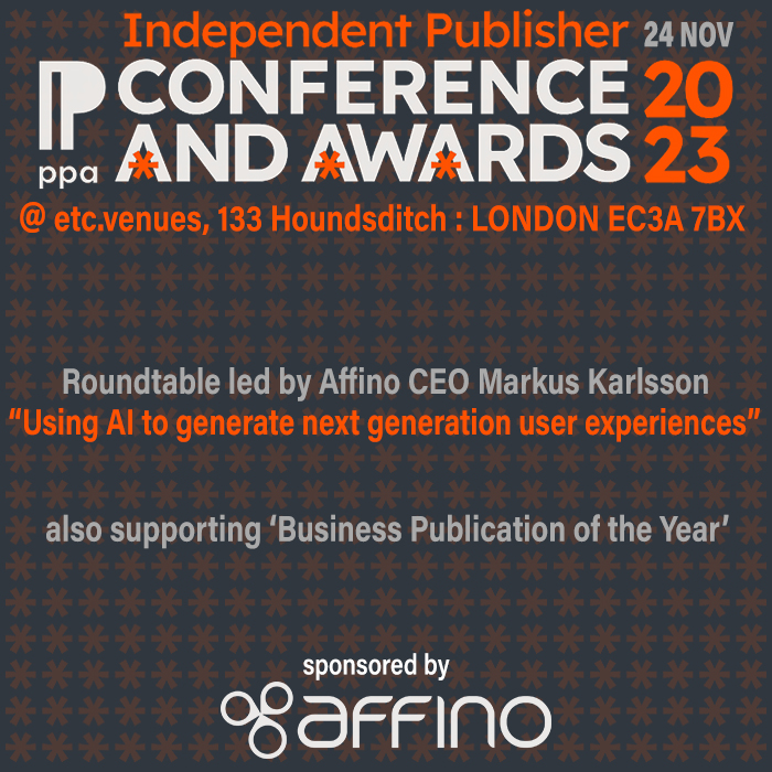
PPA Independent Publisher Conference and Awards 2023
Meetings:
Google Meet and Zoom
Venue:
Soho House, Soho Works +
Registered Office:
55 Bathurst Mews
London, UK
W2 2SB
© Affino 2024
