Affino Responsive Design Update 2

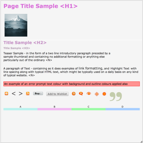
You’ll notice on Affino.com some subtle changes to how it looks and works. This is the result of it running the Alpha version of the upcoming Responsive Design Affino release. All the key component updates are now all in place, and we have split the Classic Design components fully from the new responsive ones.
Responsive Skins are now possible in Affino, but it is early days and much remains to be done before the public release. As often happens when we work through a major project, we will be using the opportunity to completely restructure the way we work on display-side code. We’re moving to an object oriented approach which is far more robust, secure and faster.
It really does mean through that we will be reviewing and rewriting every single line of display-side code in Affino which is a vast project. It means all the underlying layout and styling attributes, Design Elements, applications and templates need reworking. As will core management tools including the Live Editor and the App Bar.
It means that the new Responsive Design capabilities will be released in phases, prioritised around the new sites and projects that are being rolled out. It also means that if you have many Affino customisations then there’s a 100% likelihood that they will need updating for your responsive designs.
Here’s a heads up on where we are, and the key milestones for Responsive Designs:
New Object Orientated Display Architecture
The core architecture of the new object oriented responsive Skins is now in place. There are still key elements being ironed out and dozens (possibly hundreds) of new functions which need to be created. We have working responsive designs working though, so mostly this is just a great deal of detail work.
Key to the new page design rendering is that we will be able to roll out much more intelligence on how we build up and cache page designs. In particular we will be loading much more of the core design styles into the application memory, or simply pre-render the CSS. In fact the whole page rendering process should be significantly speeded up and be more scalable as a result.
Optimised Code
Did we mention that the display code will be optimised, I’m pretty sure we have. The good news is that for the elements we have already worked on, it’s clear that we will be significantly reducing the amount of generated styling and layout code. We are able to move a great deal more CSS and JavaScript into the Skin CSS and JS files which means that they’re cachable and http optimised.
Note though that if you create highly dynamic responsive designs then you can start to make the code heavier again with all the required media queries and additional JS that is required to re-layout the page at each breakpoint.
Upfront Page Content Identification
One of the big upcoming changes is that we will immediately identify what the primary page content is. In the current Affino page engine, we only know the primary content once the page has been rendered. This means we will be able at a stroke to remove a great deal of the inefficiency with current Affino page rendering.
New Design Styling
There are a number of key developments with Design Styles improvements which will make them much more usable and accessible. Firstly, we’re rolling Form Styles into Design styles. This means you will now be able to apply a unique Form Style to every cell / page element. Secondly, we’re renaming all the attributes to exactly match the conventions used for Cascading Design Styles (CSS) so that they will be instantly familiar to a web designer.
We’re also adding a number key new attributes such as H3, separate form text styling attributes and text case. Finally we’re updating the way that Cell IDs work within page designs. Previously these would change depending on the design of the page, in Responsive Designs they will be permanent. This means that if you write custom CSS you know it will always target the same component irrespective of how much you change your page design.
Design Frames
Design Frames replace Design Menus for responsive designs. They allow you to create and apply CSS border setting to each of your cells to create menus which can either have a header or not, both of which can be individually styled.
Design Frames are pure CSS for super-light weight presentation, and to make them instantly familiar to web designers. We’re in the middle of working through this, and you will have the option of using a pure image-based styling tool, or by setting the individual border attributes.
Design Elements
Affino has a lot of Design Elements (Widgets), something that is very apparent when they all need re-writing. To that end we have prioritised the rollout of the new responsive DEs, and not all are expected to be in the v1 responsive Design Centre. Instead we’ll be rolling out all the core ones and then quickly rolling out most of the remainder in the following release.
There will be some DEs which will never be transitioned as they’re either little used, or simply won’t transition well to a resizable reality. Instead we’re looking to create a number of new responsive ones as the need arises.
We have started the creation process and are working through the top priority list right now. In practice much of the work with the transition is front-loaded as we have to create all the display functions which will then be re-used for all the DEs. We’re looking to have the first batch complete soon.
Applications and Templates
The next step will be to work on the Affino applications and templates. These include everything from the Live Editor and App Bar through to the forums, forms, time logging, login and registration, and ecommerce engine.
These will very much be prioritised with the core apps being rolled out first, followed by the more peripheral ones, and prioritised based on project priorities, so the sooner you let us know about your upcoming responsive design projects the better.
Custom Development
If you’ve read this far, and your site has a lot of custom code, the you will need to note that the transition will be significant and it will not be possible to automate it as we have been able to do for virtually every release these past couple of years. It means that there will be a cost element when moving your custom code to the responsive designs.
The same goes for any customisation which is commissioned by you between now and your migration to responsive designs, so keep that in mind for your budgets and timings.
Affino 7.5
We’re looking to be releasing Affino 7.5 around the end of October, note though that the first release of the new Responsive Design Centre will be a public Beta. It’s going to a very exciting release and the biggest step forward Affino has made since the advent of the original Design Centre.

Did you find this content useful?
Thank you for your input
Thank you for your feedback
Upcoming and Former Events
Affino Innovation Briefing 2024
Webinar - Introduction to Affino's Expert AI Solutions - Session #2
Webinar - Introduction to Affino's Expert AI Solutions - Session #1
PPA Independent Publisher Conference and Awards 2023
Meetings:
Google Meet and Zoom
Venue:
Soho House, Soho Works +
Registered Office:
55 Bathurst Mews
London, UK
W2 2SB
© Affino 2025


