Affino.com Site Revamp Visual Guide Whistle-Stop Tour
At the start of the Covid period, we determined that we would need something of a lighter touch to contrast that societal darkness. And so we set out to wholly revamp the Affino.com website - to make it clearer, more streamlined, fresher, and more friendly - while rolling out various new technologies and functionalities. We greatly expanded the colour palette and introduced a number of more vibrant tones to meet that purpose.
I and Designer Mark Foster, with help from Lead Front-End Developer Luismi Montiel have worked on some 7 iterations of the new framework - which is now finally fully pervasive. With our busy projects schedule - this was accomplished on the ’back burner’ and using the in-between days for Client Projects.
As per the title - this is just intended to be a whistle-stop tour of some of the new site highlights - to serve as a record, and source of inspiration for others in how they might wish to evolve their own sites.
I had intended this to be something of a PechaKucha overview with 20 slides, and I’ve in fact ended up with just 2 more - which was needed to adequately document the changes and innovations.
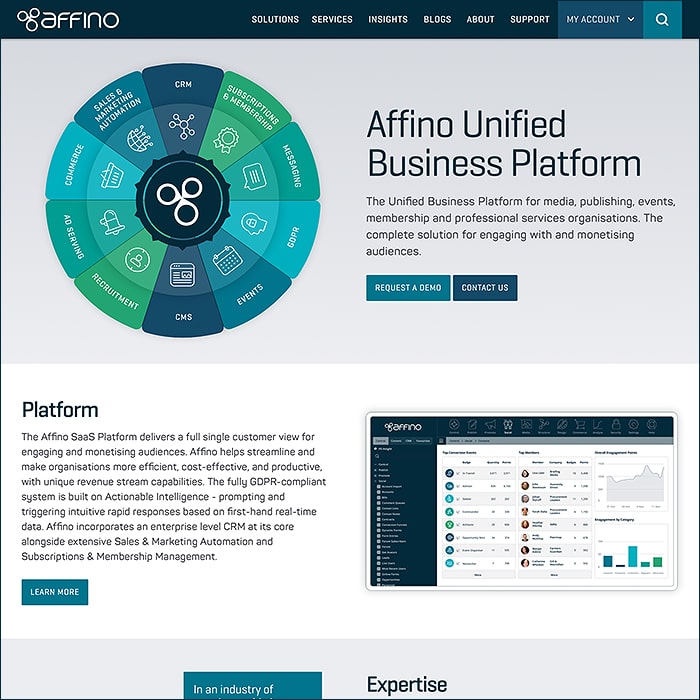
The Home Page in phase 1 started with no animation on the ’Affino Wheel’, and no Top Panel Menu - which were each added during the iterative faces. All is anchored by a main floating menu - and the Home Page serves to give a complete overview of Affino’s Key Activities
- Affino Wheel
- Platform
- Expertise
- Services
- Discover & Mission - an Introduction to Affino really
- Latest Case Study
- Affino Coronavirus Hub Banner
- Lates Affino News and Insights
- Affino News Newsletter Sign Up
- Upcoming and Former Events
- Testimonials Panel
- Get In Touch
- Did you find this content useful?
- Driving business at some of the world’s most forward thinking companies
- Our Chosen Charity - Humanity Direct
- Delivering Industry Leading Awards
- Footer Navigation
Top Menu Panel
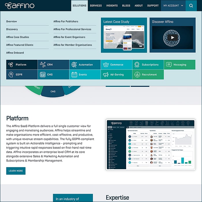
As mentioned in the intro - the Top Menu Panel was added in the second or third iteration - and gives a great lead into the Solutions section. Here we first introduced those colourful iconographic buttons too.
As other parts of the site grow - we may well roll out some further menu panels of this type - to proceed a more contextual overview for the underlying content.
Clean, Clear and Intuitive.
Solutions
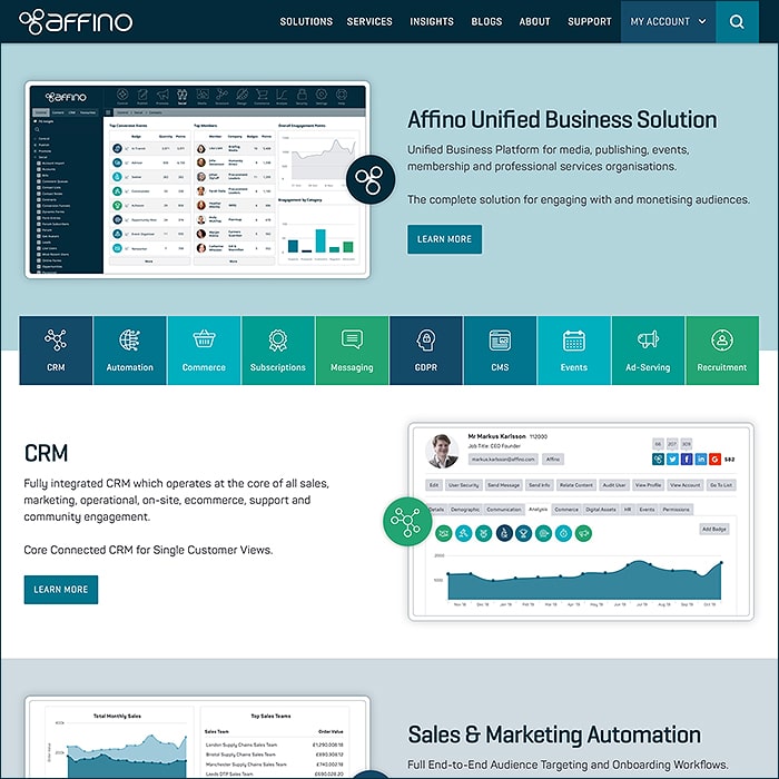
For Solutions we did an enormous exercise to simply and streamline the Affino Unified Business Solution overview - breaking that down into just 11 Elements - to fully represent all of Affino.
Previously we had a more detail-oriented overview which listed hundreds of different individual features and functions. We determined that the current format would be preferable for most prospects.
The 11 Elements being :
- Affino Unified Business Solution (Overall Platform)
- CRM
- Sales & Marketing Automation
- Commerce
- Subscriptions & Membership
- Messaging
- GDPR
- CMS
- Events, Awards & Directories
- Ad Serving
- Recruitment
As such a comprehensive solution - it's often difficult for Affino customers and prospects to keep tabs on all the great innovations that Affino commands - Hopefully the new format and pervasive Topics will help simplify the process of keeping up-to-date with Affino's many capabilites.
Unified Business Platform
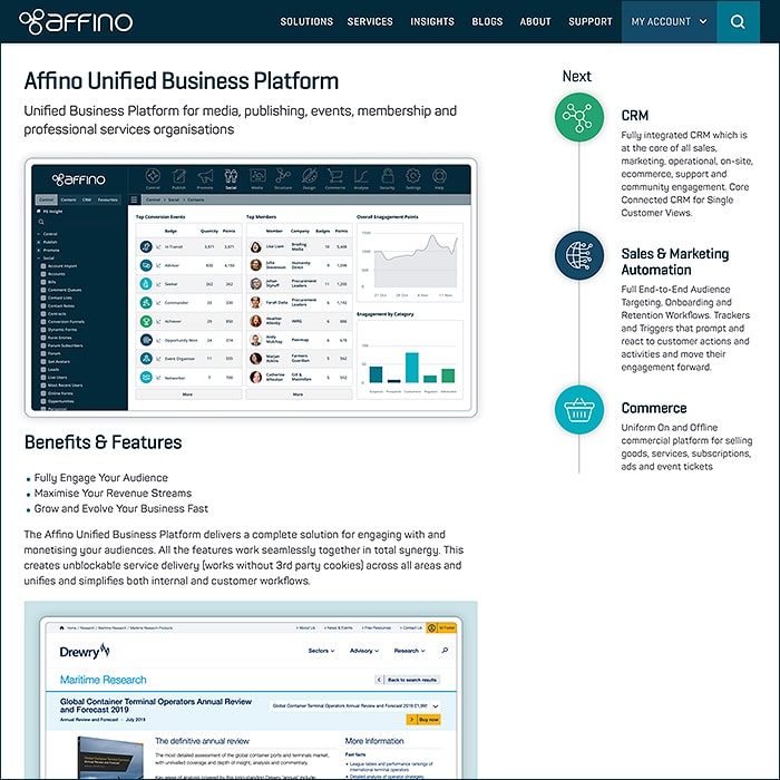
The Top Element entry features the same structure as all of these:
- Benefits & Features
- 10 Key Elements
- Key References
Note also the iconographic browsing menu to the right - encouraging further follow-up.
Case Studies
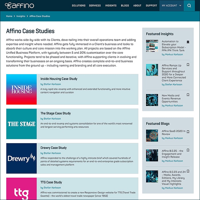
This section used to be knowns as Affino Projects - now significantly updated with more visual flare and more consistency in format and structure.
The latest case studies in particular contain a lot more detail than you would expect to find in similar accounts.
Featured Affino Clients
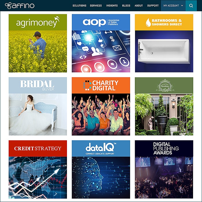
Just a slight touch-up here really - this part of the site has always looked colourful and appealing.
Rolling Circa 30 Featured Clients / Sites List.
Affino for Professional Services
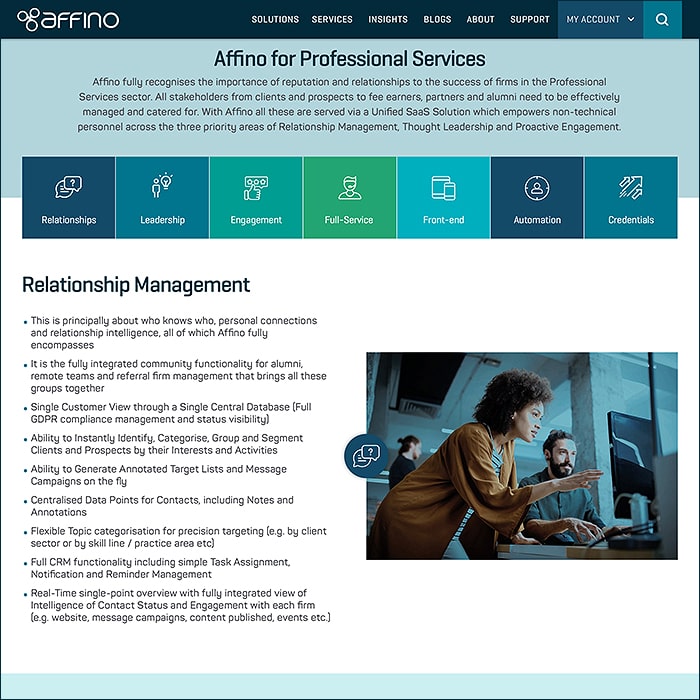
This is one of the 4 featured Audience / Sector Target Pages alongside :
- Affino for Publishers
- Affino for Events Organisers
- Affino for Member Organisations
All have those great colourful icons button menus for easy overview and navigation.
Affino for Professional Services is distilled into 12 segments :
- Relationship Management
- Thought Leadership
- Proactive Engagement
- Affino SaaS Full-Service Delivery
- Full Front-end Solution Delivery
- Sales, Marketing and Lead Generation
- Affino Professional Services Credentials
- Key Affino Solution Elements for Publishers
- Awards
- Testimonial
- Insights
- Case Studies
Thanks to James Harley, Head of Marketing and Business Development at Drewry, for insights into this sector.
Affino Services
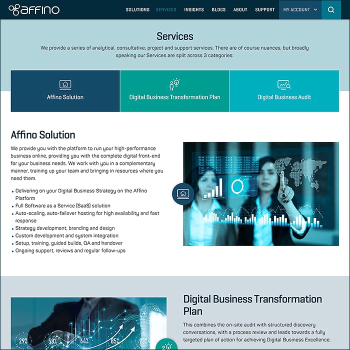
Another significantly streamlined area - distilled into just 3 key segments now :
- Affino Solution
- Digital Business Transformation Plan
- Digital Business Audit
Testimonials
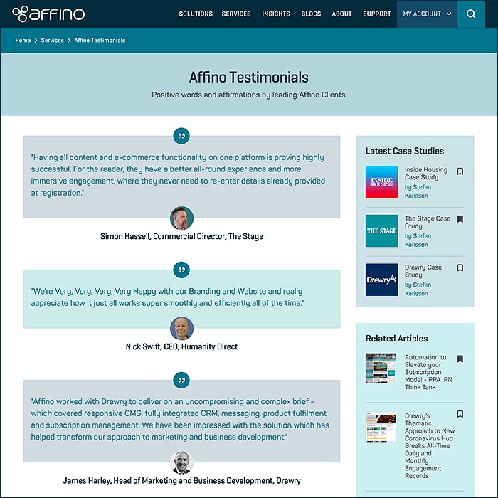
Testimonials have been refreshed, review and restored!
It can be tricky to keep testimonials fully up-to-date and current. So we've made a concerted effort to acquire fresher takes where pertinent and update all those that apply.
Different clients have different rates of response when handling these - so expect this to evolve quite significant over the year.
Affino Insights

The Affino Insights section has been somewhat sharpened, brightened and refined. Slightly better use of space and related resources now.
Go here for the more in-depth and technical analysis and overviews.
This content is mostly secured and metered for registered users and members.
View Page * (Login Required to View Articles)
Events
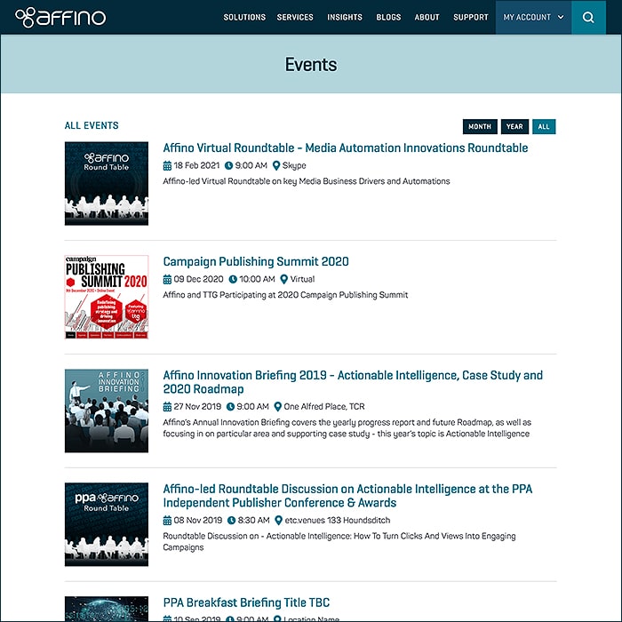
Events started out as being just Affino Internal Events, while we're now looking to include all pertinent target sector events - where relevant.
Still to come in this area are the Client/Member Collaboration Forums and Seminar Schedules - which will be increasingly important for Affino's forthcoming internal events - like the Affino Innovation Briefing Event planned for end of March.
Coronavirus Hub
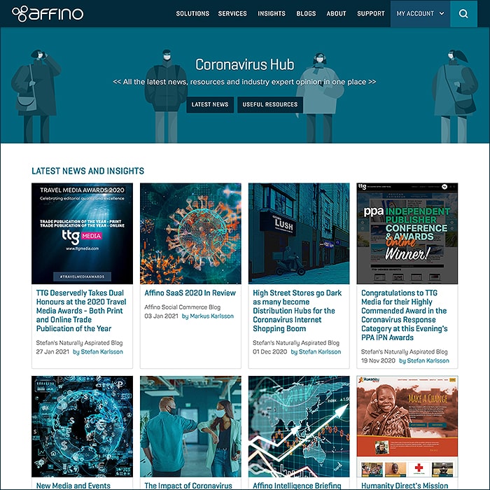
Here we were pipped by the always excellent TTG Media - who were the first to put up a Coronavirus Hub - in fact first in pretty much every sector.
We pretty much knew this to be a great idea - and were already planning our own - we of course though need to work within the gaps in the Project schedule to dedicate some time to Affino.com.
Ours was still pretty much in the first wave of these, but a few of our Clients got their first - mostly with our help too!
We're hugely proud over how most Affino Clients took on a leadership toll in their own sectors - with much the same concept that TTG Media introduced to us all!
Our page is broken down into two segments - Latest News and Insights, and Useful Resources - the latter of which lists out the various Affino Client Coronavirus Hubs and Help/Support pages on that same subject.
Customer Experience Platform
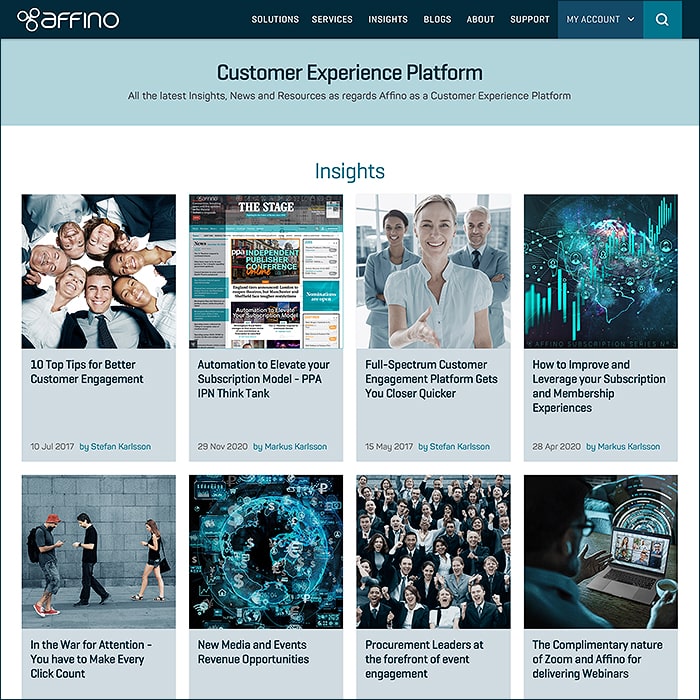
We're in the process of rolling out a number of Key Topic Landing Pages.
Our GDPR page was the first of these a while ago, and the newer versions are a somewhat refreshed take on the same mechanic - grouping together all pertinent content on the same subject.
So in this format we currently have dedicated pages for
- Customer Experience Platform
- GDPR
- Subscription SaaS
- Unified Business Platform
With several more to come. This all involves an intricate process of Topic Setting and assignment to all pertinent site content - per different categories.
Affino Blogs
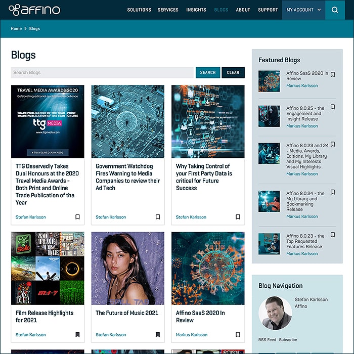
Blogs have pretty much been brought into alignment with the changes we made to Insights - with a much more expansive grid-like listing structure now - and better delineated related resources.
The colour-coding is still strong - with most visuals appearing in the duo-tone or tri-tone colour schema. We've generally brightened up those visuals more recently and used more orange as an accent colour.
About Affino
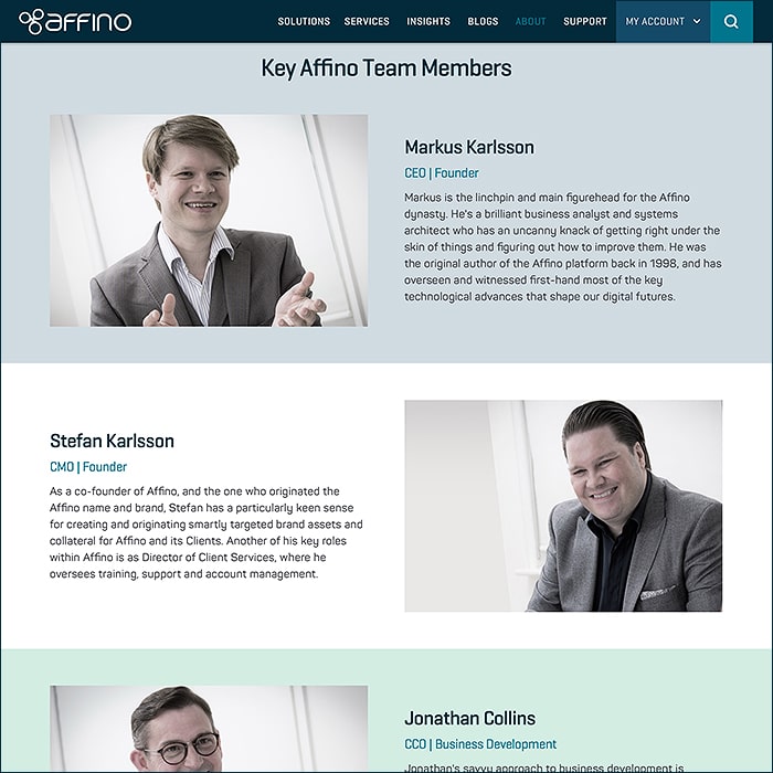
A brighter and friendlier format / take for our About Affino / Key Personnel page. Featuring most of the usual suspects!
Affino Coverage
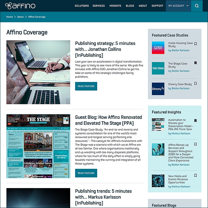
This recent addition documents Affino Article Coverage on other sites.
That is to say featured Affino articles in key publications, and on key publishing sites.
Affino Brand Assets
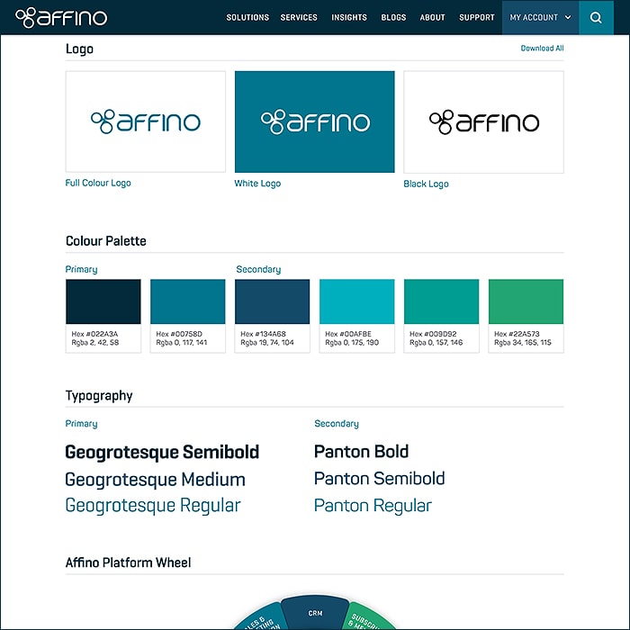
Easily one of my favourite new pages on the site.
This is essentially a mix of Press Kit elements and Affino Branding elements - it covers
- Affino Summary
- Mission Statement
- Sustainability and the Environment
- Key Contacts for Opinion and Insights
- Logo
- Colour Palette
- Typography
- Affino Platform Wheel
- Affino Platform Screenshots
- Affino Discover Video
- Social Media / Links
- Partners / Links
- Directories / Links
- Powered by Affino
- #Hashtags
- Testimonials Scroller
This is such an everyday essential resource for me and a proper Marketing toolbox as such - every site should have one of these - it separates the wheat from the chaff!
Afino Support
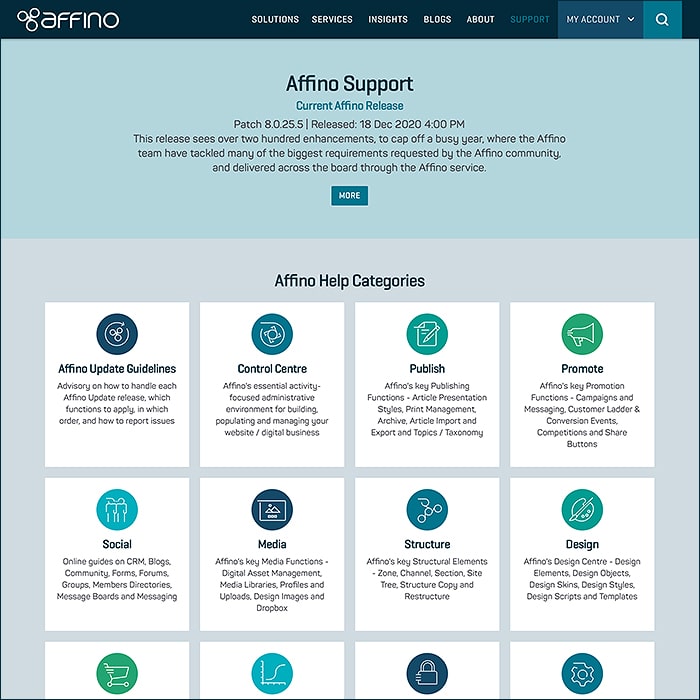
The last area to be updated owing to some custom scripting for Help Guide formatting.
Affino Support Resources have vastly expanded in both depth and breadth over the last 12 months.
Covered in this segment are:
- Affino Release Updates / Status
- Affino Help Categories
- Affino Help Guides
- General Affino / AWS Hosted Server Status
- Customer and Help Forums
- Customer FAQ
- Design Training Modules / Page
- Affino Help Guide Request
All icons and frameworks have been further refreshed and re-colourised to the new schema.
View Page * (Login Required)
Affino Design Training
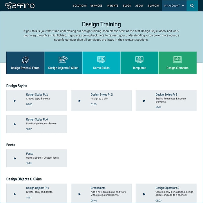
Mark Foster's Elegant Design Training Video Guides - neatly structured into key categories.
Design Training covers :
- Design Styles
- Fonts
- Design Objects & Skins
- Demo Build
- Templates
- Design Elements
View Page * (Login Required)
Affino Welcome Screen
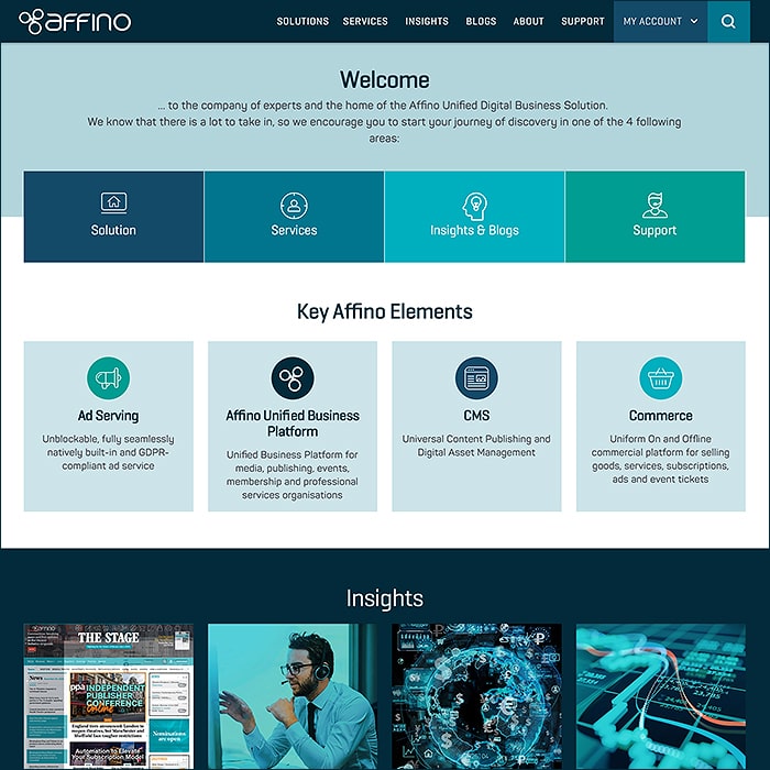
Refreshed and reformatted Member Welcome Page.
Every new registrant gets taken to this screen once they complete registration :
- Welcome Address
- Key Site Area Buttons - Solution | Services | Insights & Blogs | Support
- Key Affino Elements
- Insights
- Featured Blogs
- Recently Active Users Scroller
My Library
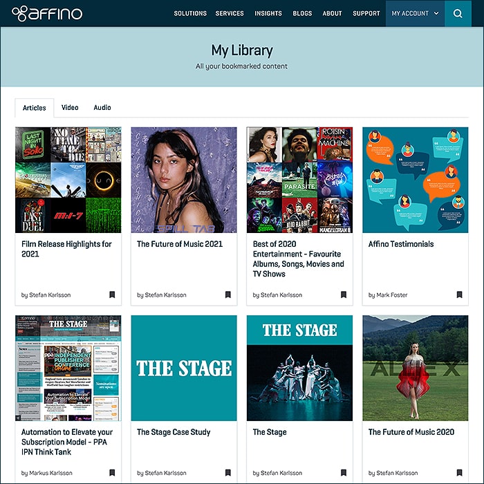
Affino's new / smart Bookmarking Utility / Page - where you can now gather together all your favourite site references in one place.
View Page * (Login Required)
My Interests
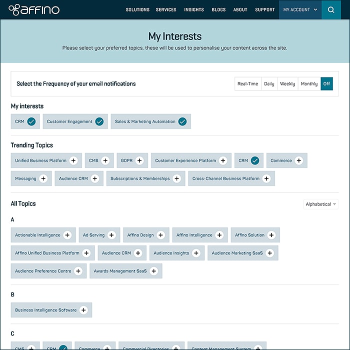
Another New Affino Function / Page.
These are all the key Site Topics - where you can identify exactly what Topics you are interested in - you can then select email notification frequency - meaning you get notified whenever new content appears against those preferred Topics.
View Page * (Login Required)

Did you find this content useful?
Thank you for your input
Thank you for your feedback
Upcoming and Former Events
Affino Innovation Briefing 2024
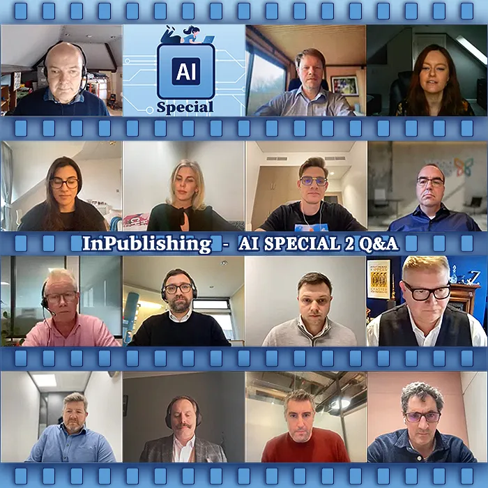
Webinar - Introduction to Affino's Expert AI Solutions - Session #2
Webinar - Introduction to Affino's Expert AI Solutions - Session #1
PPA Independent Publisher Conference and Awards 2023
Driving business at some of the world's most forward thinking companies
Meetings:
Google Meet and Zoom
Venue:
Soho House, Soho Works +
Registered Office:
55 Bathurst Mews
London, UK
W2 2SB
© Affino 2025
