Facebook has forgotten its Users
I recently clicked on a video link from Facebook. Facebook sends me nice alerts, usually many times each day.
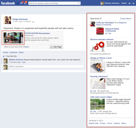
I had one recently though on Statins which I wanted to check out, so I actually clicked on the link they sent me and got the wonderful screen above.
The video thumbnail is on the left in case you were wondering, and then there’s the massive panel of ads on the right, both highlighted.
Facebook has forgotten its Users
I can see why Facebook might have ended up with this screen design. They need to appease their shareholders, including the members of the Facebook team how have shares and options.
They might also find that having the comments prominently visible drives up engagement, and provides them with more tools to provide recommendations to users, to further drive traffic.
From the user’s perspective the screen looks and feels pretty bad. There’s absolutely nothing engaging about it. If it wasn’t on Facebook, no one would stay on it for more than a few milliseconds.
It’s fairly clear that the content should have way more priority, even if it’s as simple as making it bigger.
The person who’s sharing it should also be more prominent, after all it’s the combination of the content and the person who shared it that made me click through to the page.
Wasted Ads
Now, I’ve not once clicked on an ad on the right-hand side in Facebook, I don’t even notice them. I may have clicked on something that’s been snuck into my feed, but never on the right. They take up a good 80% of the space dedicated to content on the page.
Does Facebook not monitor the fact that I never click on those ads? It might make sense for it to do so, so it can stop wasting the bits and bytes, and actually deliver a screen which is more tuned to what I actually do. Like watch the video.
More Ads
The feed ads are just a part of life by now, but Facebook will now be adding video ads as well, I’m curious to see how those will work. Will we get a Facebook ad before a YouTube ad before the YouTube clip we clicked to see.
Will it completely kill the user experience?
Where’s the Follow-on
If I hit a screen like that, where do I go next, you would have thought Facebook with it’s massive profiling would be able to provide something a bit more meaningful than the mix of blank space and ads that it has going.
It could for example take a leaf out of Mashable’s playbook where there’s always the newsfeed below any content you’re viewing.
I’m hoping that Facebook hasn’t gone so far that it’s leaving its users behind. The downward slope is a slippery one which can be hard to climb up again. Just ask My Space and Yahoo.

Did you find this content useful?
Thank you for your input
Thank you for your feedback
Upcoming and Former Events
Affino Innovation Briefing 2024
Webinar - Introduction to Affino's Expert AI Solutions - Session #2
Webinar - Introduction to Affino's Expert AI Solutions - Session #1
PPA Independent Publisher Conference and Awards 2023
Driving business at some of the world's most forward thinking companies
Meetings:
Google Meet and Zoom
Venue:
Soho House, Soho Works +
Registered Office:
55 Bathurst Mews
London, UK
W2 2SB
© Affino 2025
