Apple finally delivers much needed feature-set with iPhone 6
My last iPhone review happens to coincide with my current iPhone - the 4S.
I wrote [then] under ’Misses’:
- No 4" Screen
- No 4G
- No NFC
- No real chassis improvements - same but different antenna, same fragile glass sandwich
I also wrote back in 2010, a prescient article called ’Mobile Commerce - The New Currency’ all about the kind of Apple Pay functionality (NFC) which was announced in yesterday’s Keynote address.(Albeit now with the even more clever fingerprint Touch ID solution Apple has engineered.)
My first ever iPhone was the 3S - 32GB version (finally delivering on all my then expectations / requirements). I was delighted that 2011’s 4S doubled the memory to 64GB, since I find I always use all the memory I am given. For a very long time now, I have been waiting for 3 things really - a larger form factor, 128GB memory and NFC.
The iPhone sixes, finally have all the functionality I needed, after introducing 2 very iterative series 5s, which I always felt had an overly fragile and mis-engineered glass chassis (because of ongoing signal / antennae issues).
When I saw the first pictures of the iPhone sixes, I was not immediately taken in by the design, but the more time I spend with it, the more I like it. I also decided very quickly that the beautiful curvature of the glass really only works to perfection with the black front facia of the Space Grey edition.
Like I said previously, I was exstatic to finally be getting 128GB, so there was no question I would be getting one. It was just a matter of whether to go for the 4.7" version or or the 5.5" phablet.
In comparing the specs, the infinitely superior playback time is what really swung the vote. Also, when I work, I almost always work in split-screen mode whether on laptop or on desktop - seeing that the 6 Plus had clever layout variations for landscape mode was another thing that pushed me towards the larger model. In typical fashion I have measuered the phone against most of the coat pockets I will carry it in, and the circa 16 x 8 x 0.7 cm dimensions are large for sure, but can perfectly easily be accommodated.
Android fans will rightly of course say that there are far better spec’d Android phones already in the markeplace and due imminently, and they’re right. Samsung, Sony and the like have 3GB Ram versions vs Apple’s 1GB, they have faster processors, better screen resolutions and better battery power, even some waterproof versions ...
The one thing they don’t have though is operating system iOS 8, made for and optimised on its own native hardware. The iPhone 5S is already blisteringly fast, and the new A8 chip of the iPhone 6 improves significantly on processing and graphics handling speeds.
Price is still quite high really, but based on what I will be using this phone for it is kind of justifiable. I will also see if the phablet format means I no longer need to sport a companion iPad.
All in all, really good news for iPhone lovers, but highly unlikely to convert any Android fans.
I’m keen to see how the new health and fitness apps work, particularly with the forthcoming Apple Watch. In fact there are just two minor disappointments about this new release.
Many of us were expecting more innovation on the battery power front, which is somewhat improved, but not nearly the margin it needs to be improved by. I’m still expecting to have to charge the phone most days, I’m just hoping the larger phone’s battery gives me enough juice to sustain a typically active daytime schedule.
The final point is on the NFC solution / Apple Pay, in that it really cleverly handles your credit cards, but any e-wallet replacement needs to accommodate also the myriad loyalty and points cards we have in our wallets. I have as many as 10 loyalty cards to every credit card I own - most space in my wallet is taken up by different loyalty cards. Apple obviously needs to find a solution for those eventually too ...
Apple Watch
I was excited to hear that Apple had very recently employed one of my favourite product designers - London-based Australian - Marc Newson. I hold him as one of the three very best contemporary product designers alongside Apple’s original Jony Ive and Frenchman Phillipe Starck. Marc and Jony have already collaborated a number of times - including relatively recently on the RED Product designer series auctioned at Sotheby’s.
When I saw the new Apple Watch, I immediately thought of Marc Newson’s designs for Ikepod and in particular his Atmos clock for Jaeger Le-Coultre. Apple announced last week that Marc Newson had been added to the watch team - sounding almost like a post facto announcement.
I listened attentively to the Keynote speech, awaiting some mention of Marc Newson, but Tim Cook thanked Jony Ive for the design of the Watch. I wonder if Marc Newson was added to the payroll in part due to his own designs’ very obvious influence on the Apple Watch that was demonstrated in its final form by team leader Kevin Lynch. Looking at the Apple Watch, it looks very much like something Marc Newson would have designed! That is not to take anything away from his good friend Jony Ive ...
The watch comes in 3 different metal editions - Steel, Aluminium or 18K Gold, in two sizes - 42 & 38mm, and with 6 different strap types in rubberised plastic (fluoroelastomer), leather or steel - mostly with very clever magnetic clasps.
I’ve watched all the demos and read all the existing literature on the watches and I must say I’m pretty impressed with what I’ve seen to-date. The biggest elephant in the room here is the question of battery power, and how long really a charge will last.
The Digital Crown, push-button and gesture controlled interface is the slicked smartwatch seen by far - it really does put all the other efforts to shame. Some journalists have tried to put a downer on the whole show by decrying that since these watches must be paired with iPhones, they are not really smart enough or sufficiently stand-alone to work for most people.
I however see the potential of this device, just as I kind of saw the potential of where the iPhone and iPods where headed in their early days. I freely admit I was sceptical about the tablets, and still, as I work from home, I seem to find little daily use for my iPad. My iPhone, iMac and Kindle though are in constant use.
I have a set of basic criteria for my watches - chronograph with backlight, world time, alarms etc. - my Citizen automatically charges from any light source, and automatically adjusts to the atomic clocks of various continents - it’s a doddle to switch settings and adjust time-zones - so practicality is obviously key.
I can really see the Apple Watch becoming my watch of choice - I love the tricoder potential of its rear-plate sensors, as well as the ability to introduce more fun and games into slightly tedious keep-fit regimes. Everything that I’ve seen so far indicates a really well-though-out device with amazing potential. As I said previously, I think the team has hit on the very best user interface for such a small device. Even though the 42mm is slightly chunkier, I never seem to regret getting the largest possible screen display, be it iPhone, Desktop or Television.
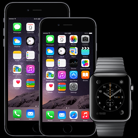
As with the slick curved glass of the iPhone - the darker metal version (pictured above) is the one that best shows off the seamless marriage between curved screen and curved watch casing.
I will surely be getting one of these when they materialise around March of next year ...

Did you find this content useful?
Thank you for your input
Thank you for your feedback
Upcoming and Former Events
Affino Innovation Briefing 2024
Webinar - Introduction to Affino's Expert AI Solutions - Session #2
Webinar - Introduction to Affino's Expert AI Solutions - Session #1
PPA Independent Publisher Conference and Awards 2023
Meetings:
Google Meet and Zoom
Venue:
Soho House, Soho Works +
Registered Office:
55 Bathurst Mews
London, UK
W2 2SB
© Affino 2024
