Is Selfridges' £40 million investment a reasonable amount for a digital retail business?

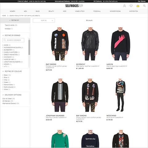
Last week saw the launch of the new Selfridges website, part of a £40 million investment over the next 5 years. I must say that I quite like the improved product pages - which are really snappy and contain near enough of the right details and features - I like the layout of the page too, although feature-wise overall it’s not quite up to my ideal customer user experience, as per what I posted earlier this year in my ’The Ideal Fashion Ecommerce Template’ article.
The previous Selfridges site was a little laggy and unfocused, while the new one is agile and crisp. Interesting to see that they have not gone with a fully responsive design framework, but are relying on adaptive for mobile screen resolutions. Shopping basket is maintained well across devices - a miniature facsimile of the famous yellow bag with a number indicator within it - works well in both formats.
I would have preferred to have seen ’how many in stock’ details, and some indication on number of days for standard delivery. Also, the Size Guide is one of those next to useless generic ones - it needs to at least say whether fit is Skinny, Regular or Generous, and also ideally what size model is wearing to give proper indication of sizing - actually model sizing is often included in main Product Details. I would recommend a mannequin you could click on for major size options and where key dimensions are displayed against the mannequin. In the overall details, there is also nothing about care instructions though - which is a big miss for me. When you buy online you don’t get to check the labels and feel the texture and finish of the fabrics - so a digital retailer needs to proved all the pertinent details which you need to make an informed decision.
Size, number and colour selectors etc. are slick, and I like the way they have included the ’Add to Wishlist’ element, although the tool tip is missing for perfect usability on that icon.
£40 million over 5 years (£8 million p.a.) is a huge investment though, and I’m not sure Selfridges needs to be investing at quite that level, or whether the ROI is fully justifiable on a singular digital business. Of course a significant part of the moneys will go to the logistics and fulfilment services, and there is still ample scope for improvement to the digital front-end. Overall it’s nice looking, minimalist and modern, but there is nothing at all innovative or new here.
The Home Page for me is a bit of a waste of real estate - going for enormous poster-like visuals with very little inherent content or value. Same for the relatively sparse category landing pages - M&S is at least along the right lines with their roll-out of themed category pages.
The site is running on the knowingly pricey IBM WebSphere platform, and no doubt some millions are being passed on in referral fees to consultants / agencies. The site is a definite improvement over its forebear, but we expect so much more from new site launches in this soon to be entirely fluid digital age. While the product search and selection is super quick and fluid, there is little fluidity between other parts of the site.
It is well known that a big challenge for retailers this year is to consolidate their inventory into a single system which works for both online and in-store. I also think the online-to-instore journey is somewhat lost. There really should be a seamless flow in and around departments and into and out of the traditional stores as well as the digital variants. I am frequently disappointed that the Lego website for instance does not list in-store purchases alongside my online ones - this is something these kinds of retailers will need to solve in the next couple of years.
It’s way too early to make a judgement call on the ROI, and it would be very interesting to see the exact breakdown in costs, what is being spent where, and what the reference KPIs and goals are. There are some vestiges of possible interesting developments - the click & collect functionality for instance. Somehow though I am wanting to see more, and expecting something a little out of the ordinary compared to what has been delivered thus far. The snappiness of the site is undoubtedly down to some high-power hosting configuration, I would love to know exactly what this is - these things are typically cloud-based nowadays. We love our statistics here, so we would enjoy seeing the number of simultaneous session ratings for this configuration.
As a retail site, it does a lot of the key things pretty well, but looses out on some of the truly clever detail touches. The design is elegant yet quite anonymous at the same time. One of the tricky things with these minimalist scalable interfaces and fully-responsive designs is being able to instil sufficient brand indicators to give the site a unique personality beyond the picture content. There are lots of greyscale / monochromatic sites out there already, and nothing in this one is particularly identifiable as being brand-relevant to Selfridges, the use of Selfridges yellow is absolutely minimal and there is no riffing of the Selfridges ’&Co’ logo at all.
I still believe it’s important to stamp an identity on your digital business, as it always has the potential to be your main point of contact with the customer, and thus the chief brand ambassador - on a typical page on this site, when you cover up the logo, the only signifier of the Selfridges brand in the tiny yellow shopping bag, I’m not sure that this is sufficient?
Even if this site had hit all the markers, and met all the high level omnichannel and user experience requirements, I’m still not sure whether 40 million would be a fair and reasonable investment for what had been achieved. That sum of money can buy a whole lot of technology and development resources - I’m pretty damn sure that similar, if not better results could be achieved with a whole lot less...


Did you find this content useful?
Thank you for your input
Thank you for your feedback
Upcoming and Former Events
Affino Innovation Briefing 2024
Webinar - Introduction to Affino's Expert AI Solutions - Session #2
Webinar - Introduction to Affino's Expert AI Solutions - Session #1
PPA Independent Publisher Conference and Awards 2023
Meetings:
Google Meet and Zoom
Venue:
Soho House, Soho Works +
Registered Office:
55 Bathurst Mews
London, UK
W2 2SB
© Affino 2024


