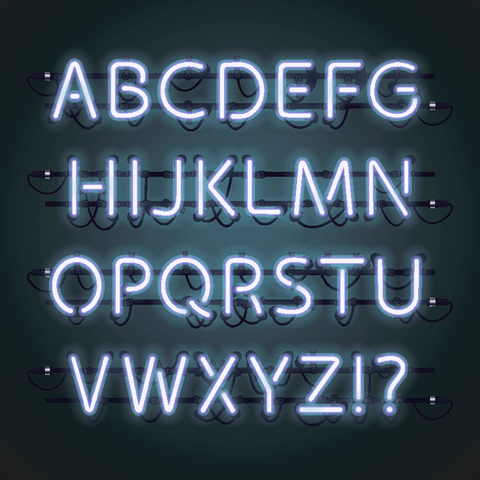
Smart Font Selection is Essential in Responsive Design

With the limitations that come with Responsive Design, you cannot use design framework accents and precise filigree details quite so much any more, certainly not to the extent of table-based HTML. The flow of responsive design relies on much simpler blocks of always-scaling elements and so font use and typography becomes a critical element for defining identity, personality, tone and differentiation / uniqueness.
Sans vs Serif
All literary types will tell you that the most legible book / periodical fonts are those embellished with serifs - i.e. small decorative lines coming off the end-strokes of the letter shapes. Such ornamentation gives the wording a better ink weight and clearer visibility on printed materials. Onscreen though the display dynamics somehow work out quite differently, as we are typically using a contrast of light-emitting pixels. Onscreen therefore, serif fonts come across too clunky, and far from being the most legible, end up giving the viewer reading fatigue. There are other key technical differences too, as text reversed out of black in white is far more difficult to read on the screen than black onto white - while both work equally well for print.
So a print-based typographer needs to forget everything they knew before and use what genuinely works on and through the screen. Mind you, not just one screen, but a succession of differently sized screens - from mobile phones, through tablets and laptops, to very high deginition desktops.
The Demise of Typography
The heyday of Typography was in the poster art of the circa early half of the twentieth century. Where the calligrapher’s art was at its height, and new letter shapes were invented per poster and drawn by hand. Then came the discipline of the letterpress and modern typesetting, through to Letraset reference typography - eventually to be forced aside by desktop publishing and digital printing.
I was lucky to have caught the tail-end of this very hand-crafted way of working, where artwork was principally photographic, and elements were properly cut and pasted with scalpel and tape. I witnessed the dying days of old-school typography, where a highly skilled typesetter (respect to Ken Button) would trace out all the pages of text in 10 point Courier font - for the artworkers to overlay on their screens and printouts to ensure correct font size and weight, kerning and letter-spacing, leading and line-breaks and widow and orphan control, all accurately and completely marked up on reams of tracing paper cut from a roll.
With brochures of 100s of pages and numerous follow-on client text changes, this way of working became just too long-winded and expensive and was eventually consigned to history. Craftsmen like Ken Button had unique encyclopaedic knowledge of the full Letraset directory of fonts - 100s of fonts and all their uses. Nowadays far too little emphasis is placed in most graphic design classes on the key role of typography. Much of the old artisan knowledge has been lost and / or is being deliberately neglected for sake of efficiency and expediency.
4 Key Font Types
A typical website will have around 4 different fonts on the page, too many more and your environment becomes confused and cluttered. Too few, and you don’t sufficiently distinguish and differentiate the functions of each text element.
In our example there are two leading fonts, and two supporting fonts essentially:
1 : Logo
The typeface of the logo / brand / product / service - the one that is copyrighted - is the key brand symbol / marker on the page, and should be unique, relevant, meaningful and memorable. When Affino designs a logo typeface, we often start with one of the less typical stock fonts, and then customise the characters to make them unique - slightly changing particular letter shapes and proportions and adding or removing tiny ornaments - even looking to create semi-serif fonts like the IKEA logo which has the tiniest of protrudrances on the ends of each letter, only really visible upon close scrutiny.
2 : Strapline
This is a secondary font which supports and is complementary to the logo, it should not fight for attention with the Logo or Headliner / Title font - its overall style is often dictated by the length of text as well as its compatibility with the core Logo font.
3 : Headline
A strong font, which again should complement the logo but yet be subservient to it. We tend to choose narrow-gauge fonts for titles as the main dimension of concern is the width of the screen, and you can fit in more characters if the font is narrower. We would also use a narrower font in the logo design if the name was considered long - i.e. more than 8-10 characters.
4: Body
Another supporting font which should yet be the most easily legible. We tend to choose more rounded and open fonts for this. The most standard of standard web fonts used to be Verdana, and you really can’t go wrong with that, but you might wish for some further degree of differentiation by using something like Open Sans or similar.
Selecting Fonts - Unique and Practical
Ideally your fonts should be rather unique yet still tone well together as a group - particularly those used for Logo and Headlines. Be aware though that not all fonts are fully responsive and some scale better than others, while lesser fonts end up with some degree of artifacts at certain sizes / weights that result in legibility issues. We encourage all our Clients to load their fonts into their sites (single-source them), rather than relying on external 3rd party web font libraries such as TypeKit - as these can be blocked by ad blockers and privacy tools.
The idea is to attain a high quality of finish - which serves both the brand, and the message. Each font can carry a number of meanings - traditional vs modern vs contemporary vs futuristic etc. - and it’s up to you and your designer to select fonts which accurately carry the sentiment and values of the brand, and that can be reliably and legibly rendered on the page.
Limit Variation
4 fonts is about right, if you start adding too many variations the page starts to look somewhat messy and undisciplined - which in turns impacts on perceived brand values and lessens legibility yet again. Also the more fonts you use, the longer it takes you to find them and for the page to load, and the more chances there are that they might not all match up on the page.
Be aware also that certain browsers and readers allow users to select their own preference fonts, which is why it is good to add secondary compatibility fonts to help those devices select the most appropriate ones.

Did you find this content useful?
Thank you for your input
Thank you for your feedback
Upcoming and Former Events
Affino Innovation Briefing 2024
Webinar - Introduction to Affino's Expert AI Solutions - Session #2
Webinar - Introduction to Affino's Expert AI Solutions - Session #1
PPA Independent Publisher Conference and Awards 2023
Meetings:
Google Meet and Zoom
Venue:
Soho House, Soho Works +
Registered Office:
55 Bathurst Mews
London, UK
W2 2SB
© Affino 2024


