The Art and Science of Symbolism and Iconography
Hieroglyphs, Pictograms and Insignia have been with us in some form from the earliest of our sapient ancestors, as featured in some of the earliest recorded cave paintings. They are an essential part of communication, used for marking territory and in the running of this modern world. We encounter them as a sometimes subtle, though typically an overt and constant barrage of marks, instructions, labels and alerts.
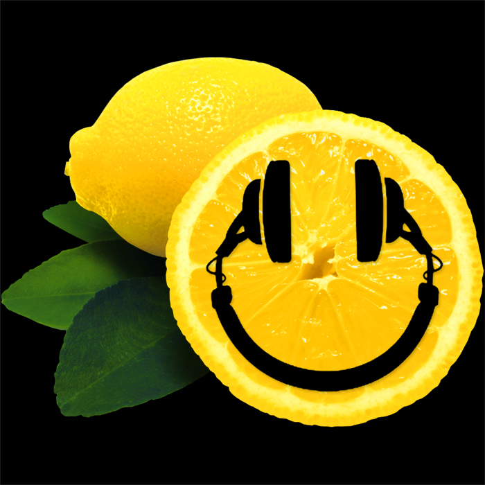
A cursory glance over the above sets of icons reveals a multitude of squares, rectangles and triangles alongside some slightly more abstract and curved forms. There is a spine of circles straight down the middle, and the icons are arranged in rows of themed families.
One of the most ubiquitous encounters you have with icons is on the home screen of your smartphone, where pretty much all smartphones now use a nigh identical set of symbols to represent the key functions. The two top rows above represent icons typically found on smartphones with juxtaposition between modern and traditional symbols as well as using variations to serve the same purpose while achieving subtle differentiation.
Row 3 should be familiar to all car owners, but hopefully not seen that often - bar the On-switch. The penultimate row has roots in the old reel-to-reel tape decks of the 1920’s, and should be obvious to anyone who has ever operated a cassette player, CD player or DVD player. The final row features common public signage which should be part of most people’s daily lives.
Pretty much all shapes convey some inherent meaning, the earliest written languages were based on pictograms. Most shapes have multiple meanings, even on occasion contrary ones. The best symbols are those instantly recognisable as stand-alone icons, many more though need a specific context or sequence to convey their function. Certain well-known symbols can even be co-opted and corrupted, as was the case with the Gammadion Cross / Swastika which was a sacred symbol for auspiciousness in Hinduism used for a few thousand years before the Nazis got their hands on it.
When we design brandmarks, we are always looking to convey meaning and inherent values in the symbols we choose, something that can be instantly recognised and has the right sort of traction with the intended target audience. Symbols form a significant part of a larger visual vocabulary, and just like William Shakespeare contributed new words and meanings to the English language, we often look to create something new and remarkable to help brands stand out against the millions of visual markers that already proliferate.
What’s in a shape
Even the most basic shape has inherent meaning:
Circle - Holistic, Unity, Infinity, Protection, Restriction, Conduit, Container, Secret, Ouroboros, Cyclical, Sun, Astrology, Timespan, Spirituality, Halo
Square - 4 Seasons, 4 Directions, 4 Elements, Corner Stone, Physicality, Solidity, Stability, Convention, Earthly, Mundane, Box, Block, Obstacle
Triangle - Fixed Direction, Speed, Peak, Elevation, Ascent, Teepee, Tent, Temple, Christianity, Spirit + Mind + Body, Warning / Alert, Equality, Stairway
The Featured Icons
Traditional Phone Handset (Design c. 1950s) - The recognised symbol for phone functions on most contemporary smartphones around the world - current generation will never have seen the forebear that inspired this symbol as near enough all phones nowadays are rectangular / candy-bar shaped
Traditional Table-top Phone (Design c. 1930s) - arrived at roughly this shape in the 1930’s - instantly recognised by most of the population, the younger generation may not be familiar with actual object that inspired the icon
Globe - The first of the Circular shapes featured, this version of the globe - without any landmasses is typically used to imply global communication or global reach, and has become a symbol used to represent the Internet, symbolically the absence of landmasses gets over the pro-European or pro-USA bias typified by a number of popularly common images of the world
Camera - This is my preferred shape - a modernish variation of a pretty standard SLR-type camera. Of course most photographs these days are taken by smartphones which is possibly one of the reasons some companies use just a lens icon to represent photography, for me - this camera shape is more obvious and instantly recognisable
Headphones / Headset - The icon of choice for numerous music services - compare with musical notes in the row below which Apple uses to mark its music functions and services - this neutral shape could also be used to represent hearing protection - for me it has a more elegance and uniformity which means I prefer it over the notes, but they can be seen as largely visually synonymous
Modern Smartphone Handset - Often difficult to discern out of context - a screen-based computing device of some description, not necessarily associated with initiating phone calls, the old handset is far more obvious and does not need to be applied in context or sequence to be easily understood
Modern Desk Phone - Very difficult to gauge what this is out of context too compared with the old phone, a phone number to the side immediately sets the scene for the icon, which is why it works well on our Affino business card, but would not work as a function button
Clock - The second of the circular icons, this one indicating passage of time, revolution of stars, planets and their satellites (moons) - a classic use of the circular form and instantly recognised around the world
Flower - Used by Apple to represent Photo Library / Camera Roll, current iOS 8 version highly geometric and abstract - flowers represent Nature, Outside, Nurture, Growth, Ecology, Agriculture, Gardening, Happiness and General Well-being
Musical Notes - The Ident and Icon for iTunes, utilised by several music services / functions, an obvious representation of music, but not as elegant to me as the more uniform headphone symbol above it
Battery - Lights up when car battery charge is dangerously low - classic old style battery shape, similar in arrangement to a 9 Volt, most people are more familiar with the barrel / pencil shaped modern batteries which are typically used to indicate % charge on smartphones
Water Thermometer - Engine Overheat alert - usually lights up when engine is low on coolant, note one of the standard visual notations for water in the form of waves - wavy lines have represented water for thousands of years now, and are pervasive across pretty much all cultures globally
Power / Standby Switch - Older cars had proper ignition keys, modern counterparts have keyless entry and a start button, numerous electrical devices feature the same standard notation IEC 5009 symbol based on an amalgamation of the common scientific binary notation of 1 = on, 0 = Off
Oil Can - Indicates when engine is running low on lubricating oil, oil can icon has remained largely unchanged since the earliest days of motoring. By removing the top plunger on the can we end up with a shape which is close to the universal icon for a watering can. Note the drop symbol too, which is another common visual notation for water and similar liquid forms
Traditional Fuel Pump / Petrol Pump - This symbol indicates you are running out of fuel, as electric and hybrid cars become more prevalent will this symbol simply be replaced by the battery one? Certain modern charging stations don’t look a million miles away from the old station forecourt pumps - with plug replacing nozzle
Stop Playback - The ubiquitous square suitably denotes cessation of all movement / activity - i.e. a complete ’block’
Pause Playback - Some cite musical notation ’caesura’ mark as the origin of the pause symbol, others cite square (stop) symbol with portion missing - i.e. a partial block; often associated with orange / amber colour in line with midway point of traffic lights
Initiate Recording - Yet another circle, this time an empty one, no one seems sure of origin, often associated with colour red. This is a classic example where you could in no way discern the purpose of the symbol without context and sequence
Initiate Playback - Triangles pointing in direction of transport originate from reel-to-reel playback devices of the 1920s, the full set then became adopted by cassette players, no one is sure who was the first to use the entire sequence of 9 symbols - 10 if you include ’Eject’ button. Play is typically associated with the green colour, another likely traffic light metaphor - green = go
Fast Forward - Two triangles indicating more speed in a fixed direction
Warning Sign - Upward pointing triangle indicating likely danger ahead - a kind of ’Look up!’ / ’Look Out!’ alert
Mortal Danger Sign - The Skull and Crossbones, the badge / insignia / standard for certain pirate crews quickly came to signify mortal peril. Symbol currently most commonly used to indicate Poison or similarly toxic substances - typically industrial, but also found on certain household goods and foods, including bitter almonds of course
No Smoking Sign - The final circle in this sequence, this time with a line through it do denote a restriction
Toilet / Wash-room Sign - Another universally recognised sign in its thousands of variations, partition denotes separate facilities for each gender
Emergency Exit Sign - Found in all public buildings, the only visible light in the cinema auditorium after main feature starts, exists in a number of variations and is universally recognisable around the world

Did you find this content useful?
Thank you for your input
Thank you for your feedback
Upcoming and Former Events
Affino Innovation Briefing 2024
Webinar - Introduction to Affino's Expert AI Solutions - Session #2
Webinar - Introduction to Affino's Expert AI Solutions - Session #1
PPA Independent Publisher Conference and Awards 2023
Meetings:
Google Meet and Zoom
Venue:
Soho House, Soho Works +
Registered Office:
55 Bathurst Mews
London, UK
W2 2SB
© Affino 2024


