The latest generation of Amazon Kindle still has a long way to go

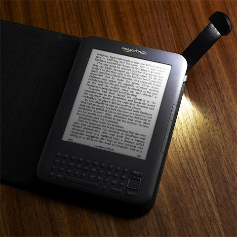
I had myself quite a bookish Christmas in many ways. Books are always big sellers as Christmas gifts in Iceland, and in addition to a number of the traditional variety, I was also the fortunate recipient of the 3G version of the latest Amazon Kindle eBook reader.
The 3G version means that I can download books from the Amazon Store - pretty much anywhere in the world, sitting on the beach for instance - having just completed the main holiday read a little prematurely.
Anyway, I thought I would share some of my opinions and experiences of said device - its obvious advantages, and unfortunately, its many shortcomings also.
Form Factor
For comparison - as a book reading device the Apple iPad really is a little too unwieldy - you cannot comfortably hold it in one hand for extended periods. Its backlit screen is certainly very attractive, and once the new iPad 2 is out with its no doubt ’Retina’ screen enhancement, this will be an even better proposition.
Amazon though have the form factor pretty much spot-on it - the paperback-size feels great in one hand, can be easily and tirelessly held and you can turn pages with the same hand that holds the device. For scholarly reasons I believe the next device needs to be just a touch larger - to accommodate notes and annotations in the margins, something that the current device does not cater for.
Screen
The Kindle’s main forte is its wonderful greyscale E-Ink screen - which renders type, and monochromatic imagery at a beautiful high level of resolution. Reading book-based content from the screen is a real joy, that part of the experience is as close to a traditional page-turner as you can get. I read the latest Richard Castle Novel in just a few days, and loved the onscreen experience. There are some downsides here though in that the screen should really be a capacitive touch-screen, this would so much improve the navigation, but more of that later. I also touched on the fact in Form Factor above - that the screen could really do with wider margins for students to append notes and observations alongside the text.
Keyboard
The small circular buttons do not make for an amazing input experience, although they are usable in as far as that goes. Bizarrely though there are no number keys here, not even number function keys - to enter numbers you need to pop up a separate ’Symbols’ onscreen panel where you use the cursor to select each ’Symbol!’ or numerical digit - individually. I really don’t understand why there are no numbers on the keyboard. It’s OK sort of, but a little inadequate.
Navigation
This is one side that really lets the device down, the navigation is really poor - you enter certain menus from the keyboard, but they are different depending on the screen you are on - so to access certain menu options you need to go to the Home screen first, and then select ’Menu’. On-screen navigation is carried out by way of a 5-way rocker switch, which is not really all that tacticle and usable. In nearly every way the Apple iBook interface totally destroys the Amazon Kindle one - you have a capacative screen so that you can click on individual words for dictionary defintions, add your own notes on passages; really the Apple interface is so much better than the Kindle one. Kindle also refers to ’Locations’ - snippet-like passages instead of pages - obviously the number of pages changes based on text size, but the ’Locations’ analogy is a little too ill-defined and amorphous. The Kindle has a long way to go to improve on-screen and advanced navigation; the forward / back page is easy and functional enough, but there is so much missing here that should be visible. For instance there is no permanent on-screen battery guage to show your power dwindling away, more often than not - the device just flashes up the ’no more battery’ message which always catches me by surprise.
Content
There is certainly a lot of content available for Kindle, but more so, there is even more content that is missing. Of the First 6 books I wanted to buy on Kindle, only one was available! I suppose the gaps will get filled over the years, but there is still quite a lot of independent publishing that has not yet made its way onto Kindle. The interesting thing for publishers here is that paper books carry no VAT, whilst eBooks are classified as software - for which VAT is required!
For Students?
This is no way a device for Students any more than the iPad is - there simply is not enough content available for a Student to solely rely on their Kindle, moreover, there is no way to make notes in margins as many Students are accustomed to do with traditional books. The keyboard is lacklustre and needs improvement also. The Kindle will only be a suitable device for Students when all of their course books are available in Kindle Format, and when they can input and append notes with a full keyboard (including numerals) and a decent navigation.
Build Quality
Build Quality is only adequate really - it’s a very plasticky device, solid but plasticky, and if you look up really close you can see that fit and finish is not quite at the 100% level. If Apple made the Kindle it would me a lovely machined aluminium with precision assembly. It’s by no means a poorly built device, but it could be a whole lot better.
Battery Life
Battery Life is quoted as nearly 4 weeks with WiFi switched off, 3 weeks with WiFi on - I’m actually getting only around 2 weeks with the device switched off, so I don’t know what that is about, perhaps I need to change some settings? Generally though battery life is fairly impressive.
Accessories
I bought one of the ingenious ’Kindle Lighted Leather Covers’ of course, unfortunately it bulks up the device and easily doubles its weight; it also does not sit as comfortably in the hand. I will probably just use the cover for travel / transport and keep the device out of the cover for normal daily use. The way the device attaches to the cover and powers the 3 bulb led light is quite clever really.
Extras
The Kindle has a lousy monochromatic browser and an OK MP3 player - I have an iPhone, so I would never really use either of these. The browser is not even quick enough on WiFi - the page refresh rate is fine for reading, but too slow for website browsing.
Verdict
As a basic page-turner the device works very well, and the screen in so easy and comfortable to read. As a complete ’book replacement’ solution, this comes up short in several areas. For me, the 3 things that need immediate improvement are Capacitive Screen, Better Keyboard and much much Better Navigation. I still think it’s the eBook reader to get right now, but it’s nowhere near the peak of it’s potential. I reckon Amazon will take at least 2 more versions until they finally totally nail this. I was hoping that this would de-clutter my life a little, but in fact it has not really, as I am compelled to still buy several paper-based books as they are not yet available in Kindle format...

Did you find this content useful?
Thank you for your input
Thank you for your feedback
Upcoming and Former Events
Affino Innovation Briefing 2024
Webinar - Introduction to Affino's Expert AI Solutions - Session #2
Webinar - Introduction to Affino's Expert AI Solutions - Session #1
PPA Independent Publisher Conference and Awards 2023
Meetings:
Google Meet and Zoom
Venue:
Soho House, Soho Works +
Registered Office:
55 Bathurst Mews
London, UK
W2 2SB
© Affino 2024


