Writing Content for Mobile

A number of our customers are having to face up to the paradigm shift of the transition towards mobile - a recent study by Pew Research reveals that almost 80% of the top fifty news sites are seeing more traffic on mobile devices than desktop. Many of those used to writing for traditional print media are finding the switch to digital formats somewhat tricky - particularly those who don’t have a history of writing for tabloids. It’s no secret that BuzzFeed is the master of mobile content - in terms of reach, monetisation and social sharing, and their format of short listicles with clickbaiting titles is certainly a winning combination. You of course don’t need to copy BuzzFeed entirely to be successful, though there are obviously a number of lessons that can be learnt from them.

Attention Grabber
You need to stand out and have immediate appeal - this means finding ways to differentiate yourself from competing media - without appearing crass or overly irreverent q.v. Editorial Tone of Voice. We know that readers have an increasingly short attention span, so you have a limited time to catch their attentions. You need to find unique and interesting angles which distinguish you clearly from the competition. Use of video and smart, cleverly selected photography is key as both can give you a critical advantage / edge.
Editorial Tone of Voice
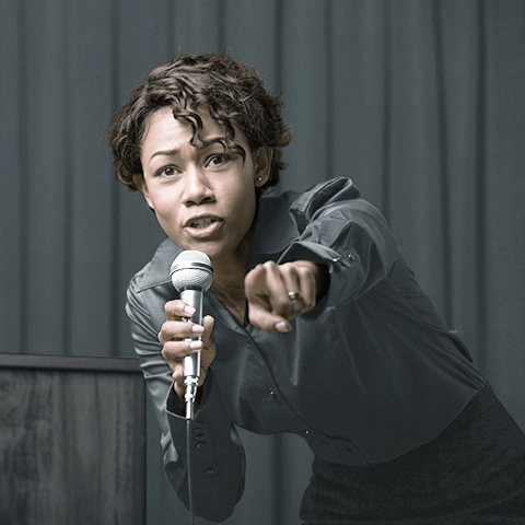
With the added competition a global media markeplace brings - it has never been more important to have a distinct personality. In order to encourage comments and debate you can no longer really report news wholly neutrally - you need to take a position. Taking a position on a news article or feature encourages support / disagreement and debate - which is exactly what you want. The more your article is commented on and shared, the bigger your impact and reach. You don’t need to be overly sensationalist in your headlines, but you cannot afford to be neutral and bland either. You should also use the byline to reinforce / mitigate the nature of your headline. The future success of your media business will be all about ’tone’.
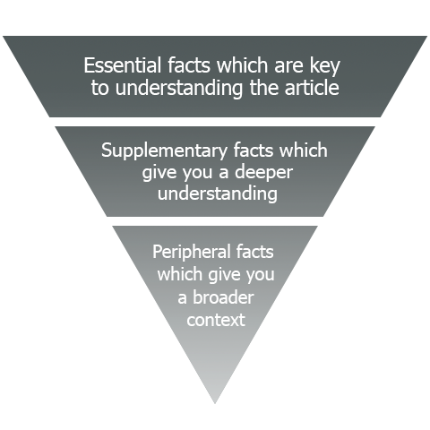
Inverted Pyramid / Digest / Short-form
All journalists should be familiar with the inverted pyramid format - that it to say - including all the key facts at the very top of the article. For mobile this really means the top paragraph, certainly no more than two paragraphs. Thereafter you have significant reader fade / fall-out - meaning those persons are less likely to react to / comment / share the article. The ’Digest’ format - a la Yahoo News Digest and Economist Espresso has proved to be particular successful, so brevity is really key here. This will always be a matter of brevity vs detail - as for certain pieces you almost certainly will not be able to be as brief as you might like - this is where the clever use of images comes in.
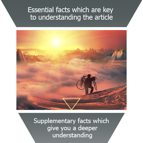
Strategic Use of Images
Beyond the main attention grabbing image, news print images have often been used to add texture, detail or simply to fill up column space. On mobile, images take a different significance. For mobile we use them as motivation to read on. That is to say if you cannot fit all the most pertinent details into the first two paragraphs you need to motivate the reader to carry on down the article. The image needs to be sufficiently arresting and interesting for the reader to want to read the following description and follow-on text - thus the use of images in mobile takes on a much more strategic purpose than would be the case for print.
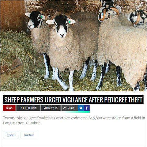
Social Sharing / Sharelines
Calls-to-action and prompts for readers to interact and share content are an essential part of modern news, and one area where mobile news differs signficantly from the largely static medium of print. Success of modern news media is increasingly about reach, which means the articles need to be set up in such a way to encourage social debate and sharing, and there need to be obvious buttons or links to initiate this form of interaction.

Did you find this content useful?
Thank you for your input
Thank you for your feedback
Upcoming and Former Events
Affino Innovation Briefing 2024
Webinar - Introduction to Affino's Expert AI Solutions - Session #2
Webinar - Introduction to Affino's Expert AI Solutions - Session #1
PPA Independent Publisher Conference and Awards 2023
Meetings:
Google Meet and Zoom
Venue:
Soho House, Soho Works +
Registered Office:
55 Bathurst Mews
London, UK
W2 2SB
© Affino 2024


