Most Events websites need considerable livening up

I’ve been attending trade and industry shows and exhibitions since I was a nipper. My earliest recollections of these were as a kid visiting the annual motorshows in Iceland, then as a graduate working for a market research company at the NEC in Birmingham, then working for an advertising agency which designed and built stands and provided all complementary marketing services / materials, and finally as a business owner commissioning my own show stand and attending as an exhibitor.
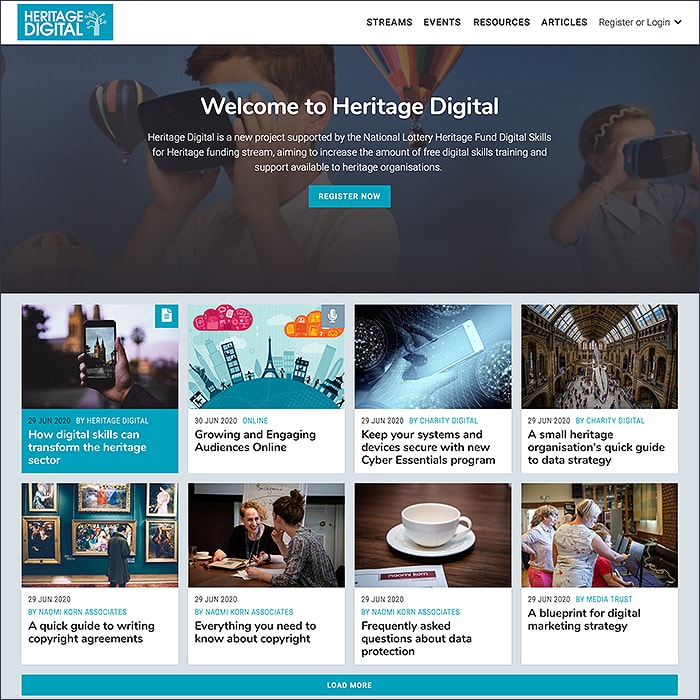
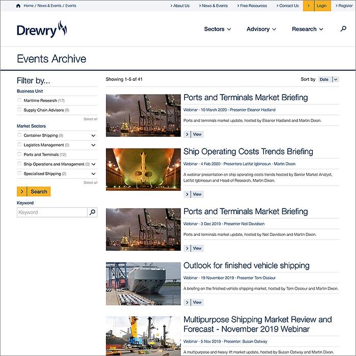
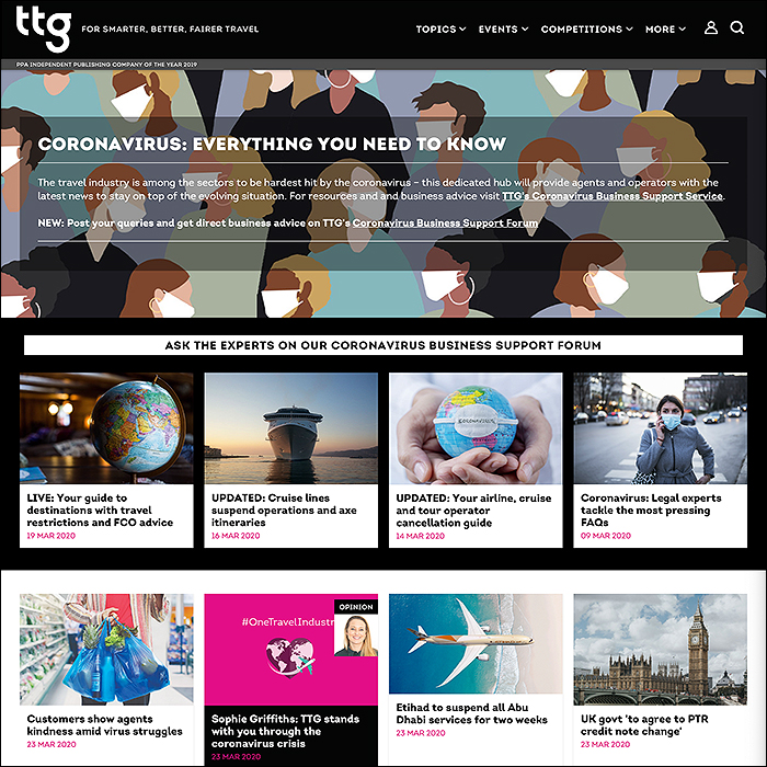
Show websites arrived in the early 90’s, and truly most have not evolved much since then. I always felt that a show / exhibition website should give some of the flavour of the real event - a little hustle and bustle but essentially a feeling of activity and vibrancy. What you usually get though is little more than an exhibitors directory with a company logo, some very basic text and a couple of attachments. Mostly the site plans / maps are not interactive, and the whole online experience ends up as very one dimensional, static, and dare I say boorish!
Events are at their core, social happenings with social interactions, yet most events websites completely forsake any kind of interactivity. There have been attempts to achieve some sort of virtual or augmented reality in the past - with a kind of vectorised 3D format where site visitors could in effect immerse themselves within an online facsimile / walk-through of the real show - none of these really worked though, and ended up being rather clunky and not providing a good user experience.
I propose that the most obvious area for improvement is in the interactive department, but other small but significant changes can also be made to improve the overall online events experience. After all, online Webinars have largely taken over from their physical real-world Seminar counterparts - there is already great technology / software for attending and then participating in a final Q&A session at an online Webinar.
These following 10 recommendations are what I would propose to improve the vibrancy, impact and long-term reach of online events - considering both the exhibitor and visitor experience:
Long-term Engagement
Most events are treated as one-offs, with little real continuity from one to the next - typically a show website is trashed and re-done from scratch from year-to-year; in fact a lot of event software functions on a single year / single event contract. All effective marketing is about building up momentum and sustaining it - you should be improving and evolving and building on top of your online show experience rather than trashing it and re-establishing it every year. Events can easily accommodate an ongoing annual cycle of promotion / preliminaries / themes and topics, then the actual live show, and then the aftermath of exposition, review, analysis and suggestions for the next one. Show websites need to become engagement hubs - almost like pseudo clubs - whose members can circulate and collaborate beyond the few days of the live events.
More Interactivity
An online show (event site) needs to be instilled with more of a flavour of the real thing with an integral community, whose exhibitors can mix and mingle with visitors, network, communicate and conduct negotiations if necessary. Show plans / location maps need to be interactive too - so visitors can easily discover and navigate to the relevant booth / stand. Visitors should be able to leave contact notes on stands if they are unable to communicate live with a company staffer / representative. The system should store the dialogues for both exhibitors and visitors so they can be referenced at a later stage.
More Newsflow
Some sites do this, but not enough really - allowing exhbitors to publish brief activity reports, PR pieces and news alerts, and also to integrate Twitter accounts for more automated updates.An active newslflow is a great tool for getting visitors on the stand and maintaining interest in your various offerings.
More Depth
The vast majority of events websites present the bare minimum details on an exhibitor - often little more than a paragraph of text and a logo. Some go further, enabling some forms of attachments, typically PDFs for press releases, white papers and case studies. I have always felt that a large header image - which you could use to display an image of the stand, or some key text panel, or other detailed graphic communication would give more of a flavour of what that company represented. Video is of course another key medium which needs to be represented on the site - all with a view to giving a deeper and more immersive experience of what goes on at the live show.
Leads Management
The key reason most exhibitors attend a show is to generate leads and make new contacts. An integral leads management system which identifies potential customers - those that had a significant interaction online for instance - who browsed various materials or left a contact note. At a basic level the system could simply flag up who showed the most interest.
Offline / Online Syncing
This is one of my major bugbears - in that there is usually far too little consistency or continuity between live show and its website counterpart. A big trend in retail this year has been the syncing / consolidation of a business’s various inventory systems - producing a singular system so that customers can see from one central location as to where stock is available. In the same way, show visitors should be able to maintain an omni-channel experience with the exhibitors through the show website. This means making contacts and appointments and engaging in dialogues. The website needs to be a proper, intuitive extension to the show, not a static standalone resource. In the early days of the Internet we used to use the term ’brochureware’ derogatively to describe a one-dimensional website experience which was simply lifted page-by-page from the company brochure. Event websites also in a similar fashion need to move away from being ’directoryware’ and fully embrace the interactive social dimension.
Appointments
Some Events websites allow you to make appointments for visits onto the stand during the show, there’s no reason why appointments cannot be extended to be a year-round facility - so that if the company has a local address, appointments could be made for that too. During the show, this functionality really helps in scheduling covering staff for the stand too, and helps you plan your daily activities.
Activity Hub
A personalised home-page for exhibitors which groups all visitor activities and contacts together for a complete show overview and leads to further analysis. The activity Hub would bring together both visitor activities and exhibitor actions - such as highlight listings of latest update posts and calls to action to populate additional content / media / communication facilities. As a snapshot, exhibitors could see who was currently online on their site, and could engage in dialogue if appropriate.
Visitor Profile
The Activity Hub is the core central resource page for the exhibitors, the visitors need their own core resource page - i.e. their Visitor Profile Page, where they can access bookmarked stands, view appointments, contact points, access downloads and relevant resources - like topical newsfeeds, as well as access historic dialogues of conversations they had with exhibitors.
More Analysis
This would be particularly beneficial for exhibitors who attended several shows - where they could compare results between shows. If Offline / Online Syncing is done properly, then they would be able gauge changes in visitor traffic between years, how many visited their stand (offline + online), who registered interest, how many appointments were made and how many leads were generated.

Did you find this content useful?
Thank you for your input
Thank you for your feedback
Upcoming and Former Events
Affino Innovation Briefing 2024
Webinar - Introduction to Affino's Expert AI Solutions - Session #2
Webinar - Introduction to Affino's Expert AI Solutions - Session #1
PPA Independent Publisher Conference and Awards 2023
Meetings:
Google Meet and Zoom
Venue:
Soho House, Soho Works +
Registered Office:
55 Bathurst Mews
London, UK
W2 2SB
© Affino 2024
