New MySpace Music Player is likely too little too late
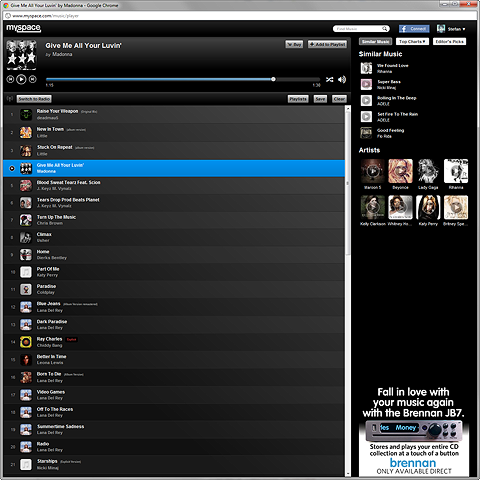
It seems MySpace is still very much in catch-up mode, as its latest offering does not really offer up anything close to the scene-changer that MySpace so desperately needs. I remember the older MySpace Player quite fondly - with its animated EQ bars and customisable colours; since then we have seen Spotify, Soundcloud, Tomahawk, Last.fm and even YouTube stealing a march on MySpace’s former lead in the online music promo sector.
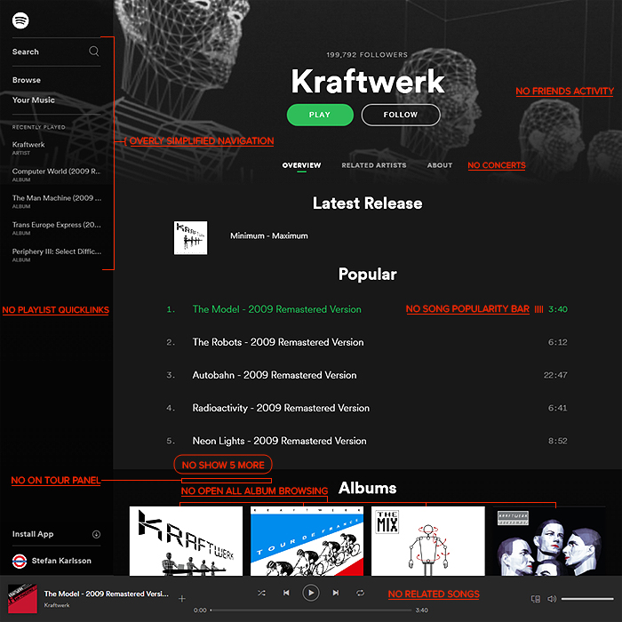
As a Music Player, it probably owes most to Spotify - in terms of its overall look and feel / usability, and recommended similar artists, playlists and ’radio’ functions. Spotify though is much further ahead with all its really clever apps and integrations.
With Justin Timberlake’s involvement in MySpace, I had high hopes that they would do something radical to try to take a leading stake in the music industry again. This Music Player is just an also-ran though, it really does not do anything better than what’s already out there, and there’s no cool function or even tiny detail touch which makes you sit up and take notice.
I’m not saying that MySpace is wholly doomed yet, but they have to do a lot better than this to make themselves relevant and worthy of our attentions once more. In the past I used to check in regularly with MySpace to listen to various artists’ latest tracks - particularly new and up-and-coming artists. Nowadays, most artists make use of Tumblr or just upload a static image to YouTube to accompany their latest promo singles. I do regular record reviews, and the number of artists who use MySpace as a primary resource is dwindling fast, these days, music artists are more likely to lead on Twitter, Facebook and YouTube. It used to be the case that new music artists broke though on MySpace - a la Lily Allen, nowdays though it’s YouTube a la Justin Bieber!
I have always said that for MySpace to succeed, they need to focus on the music-discoverability angle, which now has been largely taken over by sites like Last.fm and even Spotify, as I mentioned previously. MySpace has to come to market with something cleverer and slicker than what already exists - they need to be moving ahead, not toeing the line. If you compare the MySpace Music Player to Tomahawk for instance, MySpace is several steps off the pace, even though its presentation is more elegant. I have already outlined numerous times what I believe MySpace needs to do to regain ground, and they’re not really doing any of those things yet. The core experience of MySpace is still too unfocused and kind of clunky to navigate around. They need to give up trying to be a social network like Facebook, and just hone in on Music - strip out most of the superfluous tabs, and just have a single screen with clever adaptive panels - with integral playback experience. MySpace used to be a much more seamless experience, but is now still continuing in the fragmented vein of the last major relaunch. MySpace really needs to simplify, and then build wholly on music discoverability and dynamic playback...

Did you find this content useful?
Thank you for your input
Thank you for your feedback
Upcoming and Former Events
Affino Innovation Briefing 2024
Webinar - Introduction to Affino's Expert AI Solutions - Session #2
Webinar - Introduction to Affino's Expert AI Solutions - Session #1
PPA Independent Publisher Conference and Awards 2023
Meetings:
Google Meet and Zoom
Venue:
Soho House, Soho Works +
Registered Office:
55 Bathurst Mews
London, UK
W2 2SB
© Affino 2024

