Spotify Wrecks User Experience
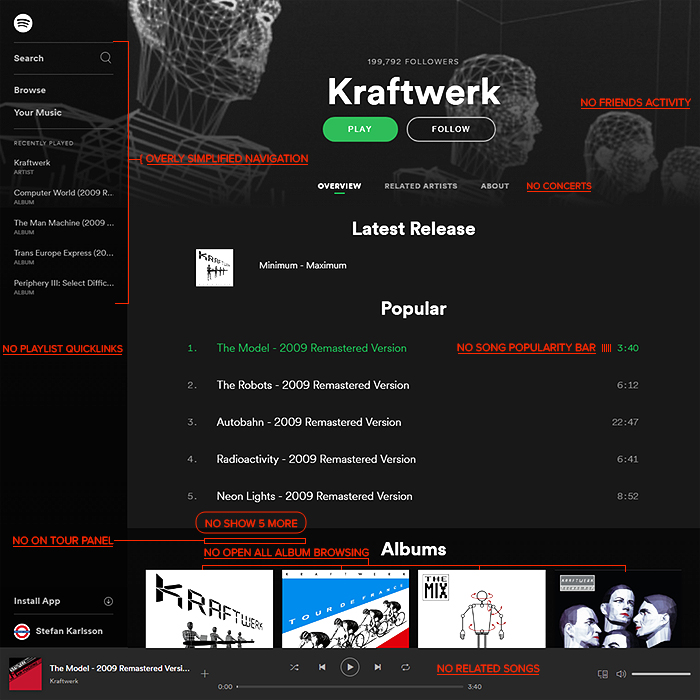
Some of you more eagle-eyed music fans will have noticed that Spotify changed a few weeks ago. What has long been one of my most significant and favourite ’Music Discovery’ tools has now been changed detrimentally and beyond all recognition (fubar for sure).
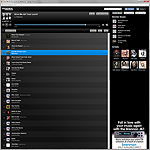
There are no longer any related songs, no popularity bars next to each song, and worst of all - you can no longer scroll through all the tracks by album in one long list - like you used to. Now you have to dip in and out of every album - which is beyond frustrating if you’re looking for a track or two and can’t quite remember which album they were on.
This functionality has always been one of Spotify’s key benefits - something which the competitors don’t offer, yet now Spotify has bizarrely chosen to ditch one of its significant competitive advantages. The whole interface is changed, and much worse in every area by my reckoning - all the smart little details that used to make this fun and properly usable are now inexplicable gone, revoked and deprecated. The navigation is so dumbed down it’s not longer sufficiently usable really.
The Mobile app would appear hamstrung to the same extent - with the Browser-based version and the mobile app appearing and functioning really very similarly.
The one bit of good news is that the Desktop App still retains the all albums and tracks long linear browse list - yet it too has ditched much of the smart functionality it used to have, and what’s more, it seems to take even longer to load up now, which is why I switched to the Browser version in the first place.
When I am working at my desk, I already have several browsers and tabs open - it takes no effort to pop Spotify up on another Tab - this has always been quick and effortless, and still is when compared to the ponderous load-up times of the Spotify desktop app. Yet all the functionality that made this an essential Tool for me is gone. I actually subscribe to Apple Music, Tidal and Spotify - and it looks like I will be using Tidal more now, as Apple Music and Spotify only really work properly on their corresponding Desktop Apps, and they are both glitchy and take too long to load up. Itunes historically is used less than 1%, Spotify probably 90% and Tidal around 10%. As a like-for-like comparison right now, Tidal’s interface is better than Spotify’s latest by some significand distance - will be interesting to see what the usage states are 3 or 6 months from now. I not upon recently revisiting Tidal, that it’s Song browsing environment is actually pretty poor too.
There is serious room in the market now for someone to step all over Spotify. Spotify used to have by far and away the best user experience and interface for music streaming, browsing and music discovery in particular, this is sadly no longer the case. Whoever manages to replicate the Spotify browser experience of old should be able to significantly erode market share away from Spotify. When you have such a large library of musical content - the UI and UX considerations are paramount to effectiveness and usability. And in its current iteration, Spotify has taken a significant step backwards.
I am one of the earlier subscribers to the Spotify service, and I am enormously perturbed by these recent changes. I may even need to review Deezer again ...

Did you find this content useful?
Thank you for your input
Thank you for your feedback
Upcoming and Former Events
Affino Innovation Briefing 2024
Webinar - Introduction to Affino's Expert AI Solutions - Session #2
Webinar - Introduction to Affino's Expert AI Solutions - Session #1
PPA Independent Publisher Conference and Awards 2023
Meetings:
Google Meet and Zoom
Venue:
Soho House, Soho Works +
Registered Office:
55 Bathurst Mews
London, UK
W2 2SB
© Affino 2024


