The Most Iconic Brand Identities
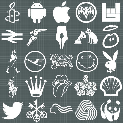
The perfect logos for me are the ones distilled down to the simplest forms, using the fewest of brush-strokes, and conveying exactly the right sort of meaning to the intended target audience. I have selected 25 of the best examples of this, where the brand values, history, mission statement etc. is perfectly encapsulated and communicated in a single symbol. Some of the symbols on this page are nigh on perfect, some only work fully within certain contexts, and others suffer a little from scaling issues. The perfect brand mark is one that is immediately discernible and understood by whomever views it, and can be used at any size and it any context. The very best logos require no words at all, just a single scalable icon.
Here are the pertinent details:
Amnesty International - human rights charity’s candle wrapped in barbed wire was inspired by the ancient Chinese proverb - ’It is better to light a candle than to curse the darkness’
Android - Google marketing team employee Irina Blok came up with android ident within days of ’Android’ platform name being selected, she was supposedly inspired by airport toilet signs; the android remains genderless and nameless, most likely deliberately so
Apple - fruit from the biblical forbidden tree, said to represent knowledge and awareness amongst other things, not a bad symbol for the current most powerful / successful business in the world - instantly recognised everywhere and carries a high-worth quality stamp with it
Bacardi - dual references to symbolism here - free-tail bats are key agents in the propagation of principal rum ingredient sugar cane - as they are significant pollinators of said plant, as well as protectors as they devour the insects that would otherwise feed on those plants. Bats were also discovered in the rafters of the first Bacardi distillery set up by founder Facundo Bacardí Massó in Santiago de Cuba
Bandsintown - Live Gig / Concert discovery / notification service and app - has found the perfect symbol to represent itself - the rock’n’roll mosh-pit ’horns’ salute for which the thumb here forms an obvious ’b’
British Rail - one of the many reasons we should bring British Rail back is this best ever representation of railways symbol - two tracks with arrows indicating outbound and return services
Goodyear - the winged foot / boot symbol identified with classical messengers of the gods - Hermes / Mercury, indicative of speed, endurance and reliability - perfect for a car tire therefore
Guild of Food Writers - certainly not well known to most, but the icon is inspired - a happy mix of fountain pen nib and diner’s spoon - two of the main tools of this trade
HMV - the dog ’Nipper’ listening to a gramophone playing back a recording of ’His Master’s Voice’ - a perfect illustration of the name
Innocent - fruit smoothies and drinks brand Well known for its caring and ethical ways is perfectly served by a very ’down-to-earth’ and friendly sketch of a small sainted being - really just a roughly drawn head with a halo - but works perfectly
Johnnie Walker - smartly dressed Victorian looking gentleman with cane implies just the sort of classy gent who should be imbibing this particular brand of whisky - the ’walker / strider’ stance of the figure suitably and quite literally underlines the surname of the brand, as well as its ’Keep Walking’ strapline
Lufthansa - a highly stylised rendering of a heron looks very much like an airplane while highly accurately also representing one of the most elegant and aristocratic of birds
Nestlé - the name literally means ’little nest’ so this is a suitable depiction of same, stems back to the origins of this now global food brand which started off manufacturing infant nutritional supplements (powdered milk etc.) The mummy bird feeding the two baby chicks is a highly apt symbol for the origin story
Nirvana - Kurt Cobain’s alter ego in sketch form - this distorted smiley became the perfect representation for both the Grunge movement and the movement’s key band
Playboy - the ’frisky and playful’ bunny was initially intended to represent the Playboy readers, but almost immediately became more synonymous with the magazine’s pin-up girls
Polo Ralph Lauren - one of the more elite sports seems a fitting emblem for the most ubiquitous of upscale preppy brands, the King’s Road is awash with these logos as soon as it gets warm enough for short-sleeves
Rolex - King of the wrist-watch is suitably served by an elegantly stylised crown, it’s no coincidence that the winder / adjuster mechanism on a watch is known as a crown too
The Rolling Stones - the most famous of band logos perfectly represents their most celebrated figurehead - you see this and you immediately picture Mick Jagger
The Royal Parks - an inspired alchemy of foliage to form a crown shape, was mistakenly sent to the Queen rather than her equerry for sign-off, she of course had the good taste to approve this logo immediately
Shell - what better representation for a fossil fuel company than a stylised form of the very type of fossil that fuels its wealth. BP has gone down an entirely different route - with a more organic / flowery logo which tries to appease consumers with environmental concerns - Shell has no qualms about revealing its true colours
Twitter - Birds Tweet, Twitter is all about Tweets and hence the perfect symbolic form for Twitter is a highly stylised bird - the cleverest of the social media brand marks by far
UBS - When you think bank (in this case Union Bank of Switzerland), you first think of safety and security, you want your money sealed away behind lock-and-key - one of the very best illustrations of security therefore is 3 hefty looking keys - indicating you hope that your finances are well guarded
Wella - a much better version of the female cameo / silhouette than competitor Schwarzkopf - whose icon lacks the long lustrous flowing locks of its Wella counterpart
Woolmark - an ingenious and simple representation of a ball of yarn, found on a small label on most wool garments and used globally in wool fabric industry advertising campaigns
WWF - Originally designed in 1961 by founder Sir Peter Scott, it reached its current incarnation in 1986 - what better way to appeal for donations than with the cuddliest of endangered animals. As you can see in the above visual, the logo is much weakened in its white-out version, because of the highly specific colouring of the animal (including the ’panda eyes’) the primary black version is really the only way to go (tricky with dark backgrounds therefore)

Did you find this content useful?
Thank you for your input
Thank you for your feedback
Upcoming and Former Events
Affino Innovation Briefing 2024
Webinar - Introduction to Affino's Expert AI Solutions - Session #2
Webinar - Introduction to Affino's Expert AI Solutions - Session #1
PPA Independent Publisher Conference and Awards 2023
Meetings:
Google Meet and Zoom
Venue:
Soho House, Soho Works +
Registered Office:
55 Bathurst Mews
London, UK
W2 2SB
© Affino 2024
