Affino 7 Smart Additions

Along with the numerous innovations in look, feel and function, Affino sees some clever introductions in pretty much all areas of the day-to-day site-management experience.
We’ve always billed Affino as the most productive environment for full-featured site management, and even though some of these innovations are merely in the field of graphics or animation - they make for significant improvements to the overall satisfaction you get from using Affino. Here follow 7 highlights of what’s coming in the new release:
New Live Edit Switch | Bar
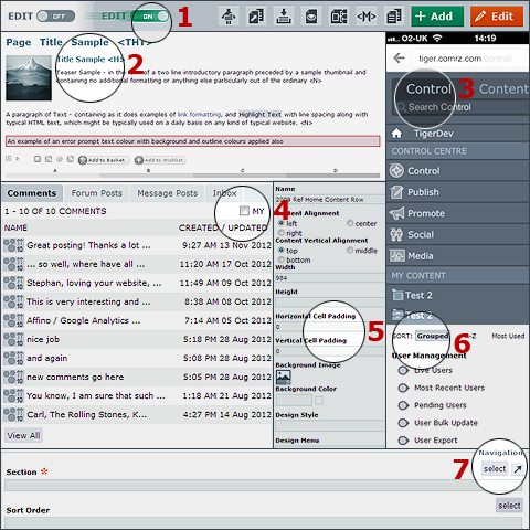
The new Live Edit Bar visibly pings in from the left of the screen as you switch from ’Off’ to ’On’ mode - all icons have been made clearer and more refined too
Design Style Preview
Enhanced Design Style Preview conveying exactly the different font sizes, formats and colours in their onscreen appearance, and featuring newly introduced Line Height, Word Spacing and Letter Spacing options
Mobile Format
Affino has a dedicated smart interface for Mobile Format - specifically Smartphones - where everything has been sized up and simplified for Affino control on the move
’My’ Filtering
Control Centre Panels are now reduced into singular displays where users can filter out their own content for all the different relevant content categories - taking you from overview to granular detail in just one click!
Cell Padding
An essential for Mobile Format skins - where cell spanning is a no-go and you don’t want text butting up against the screen edge - all Design Object Cells now have Horizontal and Vertical Padding options
Category Sorting
All Control Screen Category Selections now include a Sort mode where you can arrange listings to your own preferences via Grouped, A-Z or Most Used options
View Selection Button
Every Content Selection now has an additional button where you can pop-up a contextual screen - to view, organise or add further categories, if what you require is not currently available for selection - this hugely simplifies the admin process for newbies

Did you find this content useful?
Thank you for your input
Thank you for your feedback
Upcoming and Former Events
Affino Innovation Briefing 2024
Webinar - Introduction to Affino's Expert AI Solutions - Session #2
Webinar - Introduction to Affino's Expert AI Solutions - Session #1
PPA Independent Publisher Conference and Awards 2023
Meetings:
Google Meet and Zoom
Venue:
Soho House, Soho Works +
Registered Office:
55 Bathurst Mews
London, UK
W2 2SB
© Affino 2025


