Google's New Chrome Ad Filter / Blocker and what you need to know
Back on February 15th Google introduced a number of new ad filtering algorithms into its Chrome browser - these have also come to be known as ’Chrome Filtering’, and are a series of automated processes which protect users by screening out questionable advertiser behaviour.
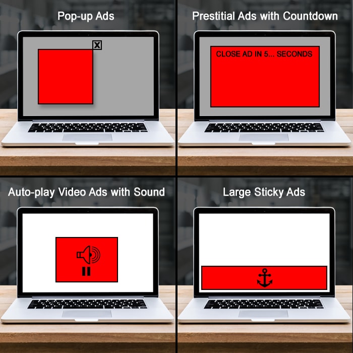
The new guidance is split across Desktop and Mobile devices, and I will refer to the diagrams in each of the included images - which I have updated for greater clarity.
DESKTOP
Pop-Up Ads
Ads which pop-up in any manner have long been considered pretty toxic - whether pop-over, pop-under - new tab etc. Any variation of this is now blocked by the ’Chrome Filter’.
Prestitial Ads with Countdown
These are the heirs of the splash screen of old, sometimes called take-over ads, and can be of either the static or video / animated variety. Anything which lingers unprompted in such a manner is screened out.
Auto-play Video Ads with Sound
These are ads which automatically start playing with full volume as soon as you hit the page, I can recall seeing lots of these on the Designboom site at one stage - again, most annoying for users and now screened out by the Chrome Filter.
Large Sticky Ads (>30% Screen)
These are ads which typically lock themselves to the top or bottom of your screen and sit on top of the content - these occasionally have delayed shut-down too, but generally users and now Google don’t like these if they exceed 30% of the total screen real-estate.
MOBILE
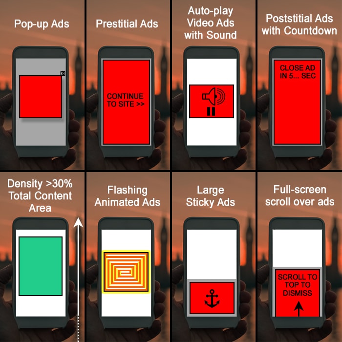
Pop-Up Ads
Same as for desktop and a lot more fiddly to shut down on mobiles. Now screened out by the Google Filter.
Prestitial Ads
Classic take-over / splash screen ads which impose themselves on the user and cannot be easily navigated around.
Auto-play Video Ads with Sound
Same again for desktop - video ads starting by themselves and at full volume - Google will screen these out.
Poststitial Ads with Countdown
Sort of screen take-over ads which force you to withness the ad for a set period - usually 5-30 seconds.
Density >30% of Total Content Area
This one took me the longest to understand. It actually means the total proportion of ad real-estate as a proportion of the height of the entire main content area. In Affino terms this means everything within the Prime Content Area - and all the Ads together (campaign placements) which occupy that space cannot amount to more than 30% of the height of the total prime content area!
Flashing Animated Ads
I'm frankly still surprised I see these - but there are still some of these around which fight for attention by being as destracting as they possibly can - a little like an annoying neighbour who keeps leaning on his car horn.
Large Sticky Ads
Same as per desktop - anything occupying more than 30% of the total screen real-estate, which differs significantly from the 'Density' rule which is as a proportion of the entire content real-estate.
Full-screen scroll over ads
These can appear in a number of ways - sometimes they look like they are scrolling above the content, and sometimes through an expanded slot beneath, but the mechanism is the same - you are compelled to scroll through the full screen ad and cannot avoid it by other means.
Further Resources
The Coalition for Better Ads has a series of really smart and very clear animations here:
www.betterads.org/standards/
Which I recommend viewing if you are still confused.

Did you find this content useful?
Thank you for your input
Thank you for your feedback
Upcoming and Former Events
Affino Innovation Briefing 2024
Webinar - Introduction to Affino's Expert AI Solutions - Session #2
Webinar - Introduction to Affino's Expert AI Solutions - Session #1
PPA Independent Publisher Conference and Awards 2023
Driving business at some of the world's most forward thinking companies
Meetings:
Google Meet and Zoom
Venue:
Soho House, Soho Works +
Registered Office:
55 Bathurst Mews
London, UK
W2 2SB
© Affino 2025


