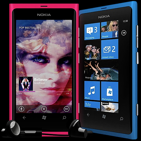
Is Nokia's Gorgeous Lumia 800 enough to get it back in the Smartphone Race?

In the wake of the slightly disappointing iPhone 4S and equally disappointing Galaxy Nexus launches, we now have the supposed saviour of both Nokia and the Windows Mobile Platform to contend with.
Much has been written about the fabuolous usability of the Metro Tiles which are the cornerstones of the Windows experience, versus the app icons of Android and iOS. For those that first come to Windows Mobile, the interface initially seems highly intuitive and seemingly the wave of the future. However, as you live with it, you discover, much like any interface - that it has its various weaknesse as well as strengths. In fact, this latest incarnation of Windows Mobile (as a platform, not Mango!) has been out for a while now, and it has failed to get any real traction with consumers.
Both iOS and Android are significantly ahead of the Windows Platform - in terms of maturity, apps, ability and consumer uptake. The Windows Mobile Platform has just a tiny percentage of the market - so was Nokia right in choosing Windows over Android?
Before we answer that question, we cannot fail to be impressed by the flawless elegance of Nokia’s new design. In my opinion, in pure hardware design terms, this is unequivocally the prettiest smartphone currently on the market. Whichever way you turn it, the minimal detailing is quite stunning. I would have gone one further and omitted the chrome panel around the camera - but then again, I really like minimalistic design. The liquid-like curved screen and concealed ports just add to the quality feel of the single piece polycarbonate shell (available in Magenta and Cyan as pictured, as well as regulation black!). So as far as we are concerned, design-wise it is amazing, and it features a separate and specific camera button - to match its superb 8MP Carl Zeiss lensed camera.
Now for the obvious downsides - only 16GB of onboard memory (with no memory card slot), and no front-facing camera (which is now a must for helping teenage girls apply their makeup!); also no 4G and no NFC. The limited memory and camera are totally a Windows restriction, as Nokia’s identical Meego-running N9 handles upto 64GB of memory, and features a front-facing camera!
What actually lets the Nokia Lumia 800 phone down therefore really is Windows - through its lack of apps, lack of memory support, and lack of forward-facing camera support. When you put this phone up against the best on Android and iOS, the phone is obviously a little lacking, which is a great shame really, as it is the best-designed smartphone yet. Nokia has tried to make up for these shortcoming with its own software bundle of ’Drive’ turn-by-turn navigation, which Android also has in its own fashion, its own Nokia Music Player and Store - with free Music Mix ability, but then iOS and Android have a dozen different Music app / player options, including industry leader Spotify, and then there is the ESPN Sports Hub, where again - all the individual components are already available to iOS and Android users.
I have read on several forums and bulletin boards that Android Users would have been very keen to get their hands on this phone (had it run on the Android platform). For me, the biggest omission is the lack of onboard memory (which I need for my own music box / jukebox purposes), even though Nokia includes 25GB of cloud storage, the minimum nowadays for a smartphone’s onboard memory is 32GB really.
I honestly think Nokia made a mistake in going solely with Windows, they should have kept their options open and made their phones compatible for the current leading smartphone platform - Android also. I fear Windows is just too far off the pace to catch up, and Nokia will suffer in tandem with Window’s relatively low market share. The current Windows offering is not really up to bar, and it has resulted in a lower-specced phone than Nokia should have been delivering at this juncture. Even with a great Amoled screen, the resolution is far lower than the leaders on the other platforms. Nokia might lead on design, but is seriously lags on features - bar the camera, which is by all accounts excellent.
Below are the essential head-to-head stats:
| Nokia Lumia 800 | Samsung Galaxy Nexus | iPhone 4S | ||||||||||||||||
| Resolution | 800 x 480 | 1280 x 720 | 960 x 640 | |||||||||||||||
| Screen Size | 3.7" | 4.65" | 3.5" | |||||||||||||||
| Processor | 1.4Ghz | 1.2Ghz | 1.1Ghz | |||||||||||||||
| RAM | 512MB | 1GB | 512MB | |||||||||||||||
| Max Storage | 16GB | 32GB | 64GB | |||||||||||||||
| Front Camera | X | 1.3MP | VGA | |||||||||||||||
| Rear Camera | 8.0MP | 5.0MP | 8.0MP | |||||||||||||||
| Video | 720P | 1080P | 1080P | |||||||||||||||
| Battery | 1450 mAh | 1750 mAh | 1420 mAh | |||||||||||||||
| Dimensions | 116.5 x 61.2 x 12.1 mm | 135 x 67.94 x 8.94 mm | 115.2 x 58.6 x 9.3 mm | |||||||||||||||
| Weight | 142g | 135g | 140g | |||||||||||||||
| NFC | X | √ | X | |||||||||||||||
| 4G | X | √ | X | |||||||||||||||
| Barometer | X | √ | X |
Needless to say, Nokia has not changed my opinion in the slightest, and I am still set on a 64GB iPhone 4S - just as soon as they have them back in stock again!

Did you find this content useful?
Thank you for your input
Thank you for your feedback
Upcoming and Former Events
Affino Innovation Briefing 2024
Webinar - Introduction to Affino's Expert AI Solutions - Session #2
Webinar - Introduction to Affino's Expert AI Solutions - Session #1
PPA Independent Publisher Conference and Awards 2023
Meetings:
Google Meet and Zoom
Venue:
Soho House, Soho Works +
Registered Office:
55 Bathurst Mews
London, UK
W2 2SB
© Affino 2024


