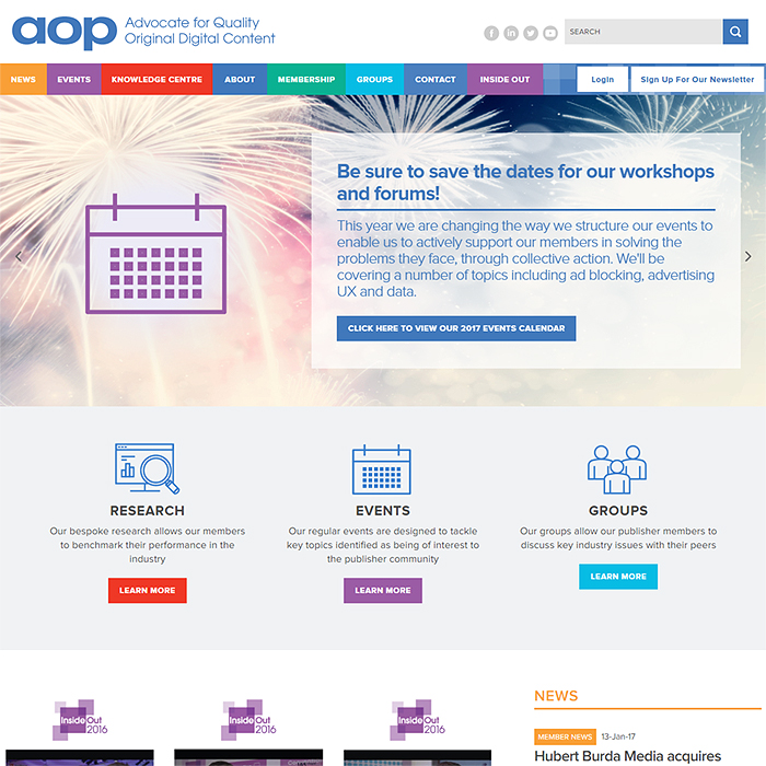
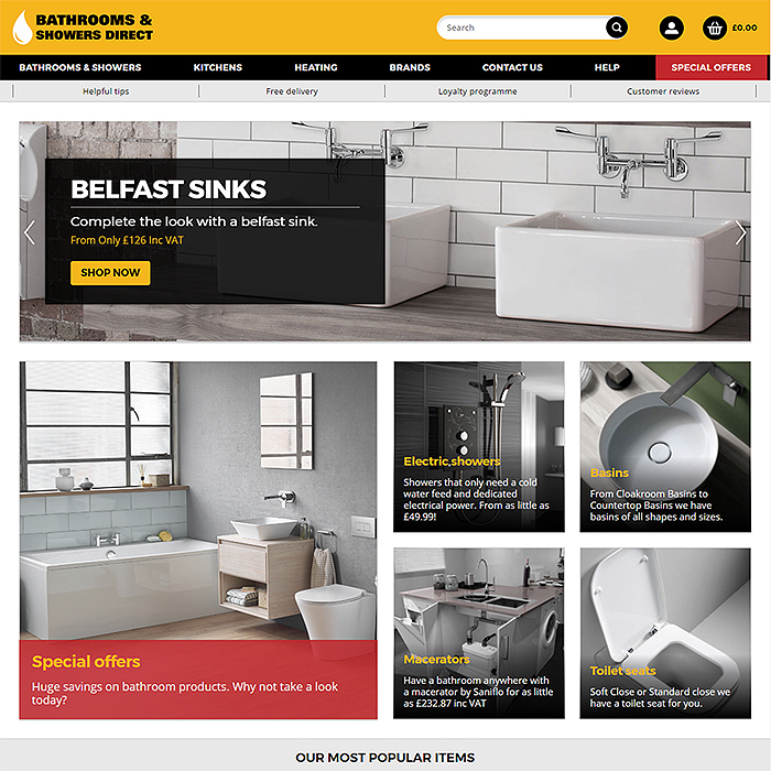
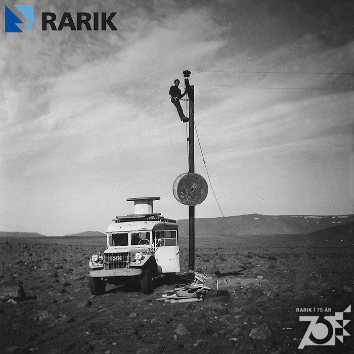
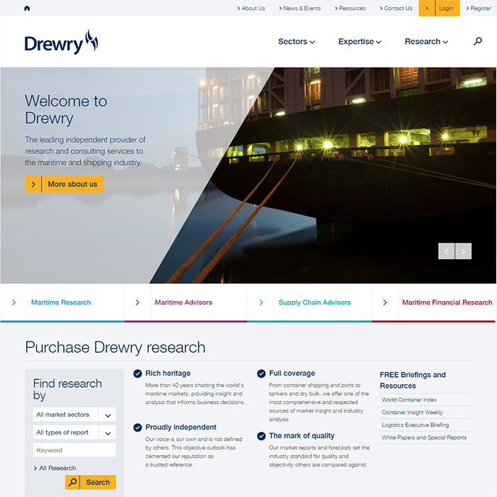
RARIK Boosts Engagement with sharper, more interactive and more informatic site
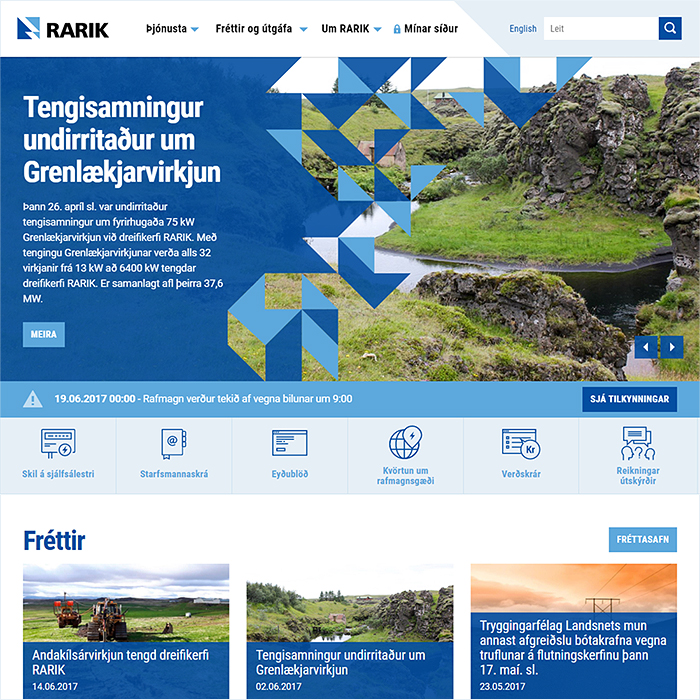
RARIK (Iceland State Electricity Company) has been an Affino Client from the earliest days. We’ve had a close and friendly cooperation throughout this time with the core Marketing and Technical teams. Yet in 2015, with a view to challenging the status quo and get some fresh input on a new responsive design implementation, management decided to put the site re-design and re-build out to tender.
A neutral third party was brought in by RARIK to oversee the specification and tendering process - one Sigurjón Ólafsson - who was instrumental in gathering and setting out the full requirements. Throughout the process, the Affino team had the advantage of knowing the strengths and weaknesses of the existing site framework, and already had several ideas on the back-burner as to how things could and should be improved. Of particular importance was to increase the value and worth of the site - in terms of its core customer appeal and engagement - to deliver a better experience to the consumer all-round.
We did a lot of research on European power company sites and identified which stood out and for what reasons. All of those ideas were distilled down into key components within our winning proposal, which carried strong branding markers throughout.
Collaboration
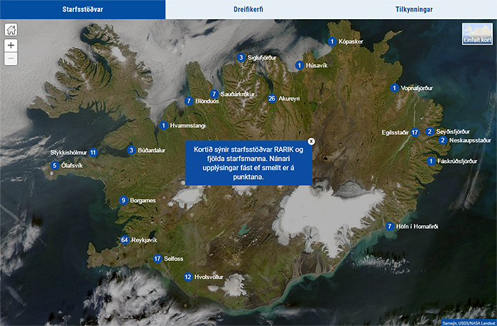
The project was largely handled by a 4-man committee, with Rósant Guðmundsson and Ólafur Gíslason representing RARIK, Sigurjón as Project Manager and myself for Affino. There was of course a significant implementation team here at Affino, and we also collaborated with Sölvi Bergsveinsson of mapping specialists Samsýn - who provided a major component for the Home Page of the site in the form of the above pictured 3-tabbed map.
As part of the earliest analysis and requirements, there were a number of elements identified as must-haves. The main issues with the incumbent site was that it was felt to be a little too static, and not sufficiently engaging for the typical electricity consumer. We worked to improve the relevance and interactivity of the site and to find ways to better engage and connect the consumer with the daily activities of RARIK. We had to ramp up the appeal and make everything more personable and user-friendly.
As a government-run entity, there were also various consideration to be made for all manner of back-office public authority workflows. RARIK utilises numerous internal systems, several of which touch on or feed into the main site. Of course not all of those systems can be converted to Affino, so several APIs and webservices were needed to connect areas like meter-reading and the main service desk and user accounts system.
We used InVision extensively to collaborate on the design and user experience phases - which evolved significantly from the winning artworks. It proved essential in streamlining and unifying the designs across the various breakpoints.
Solution
As with many of the recent implementations, we are still in the process of transposition to fully responsive Affino 8 - meaning that key parts of this project involved updating existing solution components, sometimes re-originating them entirely based on changes to requirements.
The element that took the longest time to finesse was no doubt the large map element on the Home Page (see 'Collaboration' above) - which gives customers a slick interactive interface for viewing the locations of regional offices - with contact information, then being able to view the entirety of the national distribution network grid, and finally a panel indicating geographical areas impacted by active incidents or forthcoming works - very much the same sort of information appearing on the Alerts Bar - but obviously in a more pictorial format.
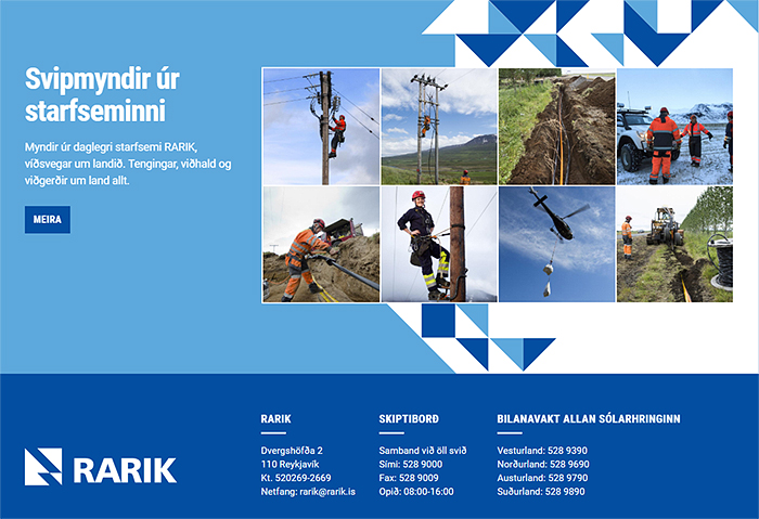
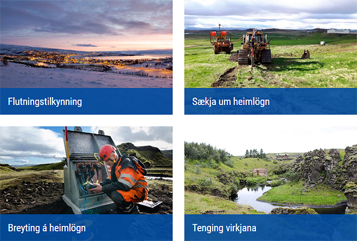
On the Home Page is also to be found the Alerts Bar - which flags up active outage alerts and forthcoming works notices. We introduced some subtle transitions into the home page - to further enhance customer engagement - like the flip-overs on the above 'scenes from work' photo library.
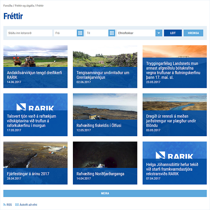
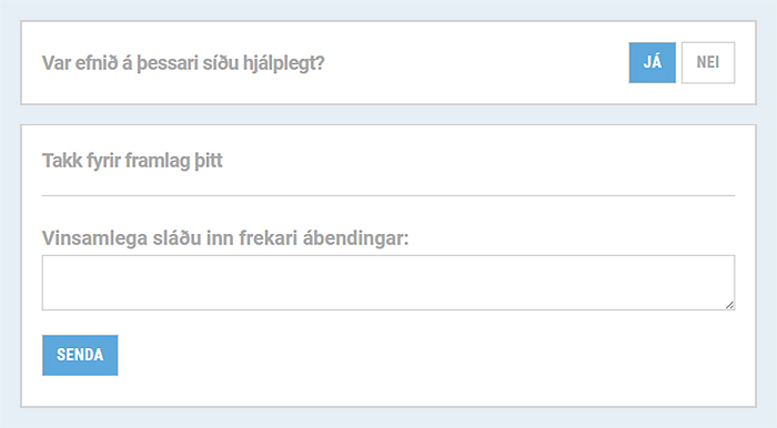
For the main News page (Fréttir) we introduced a new design layout management approach - by way of the Smart Article Listing Design Element and Smart Article Listing Grids - which allowed RARIK to achieve their exact desired format, with easy update-ability to hundreds of different styles and formats. Tied into this page was also the brand new On-Page Feedback element which a number of our customers have since put into good use (Was this page useful? - Yes | No) - seen below in its Icelandic language variant:
We needed to wholly rethink, redesign and re-originate our Content Subscriptions functionality, which used to be based on logged-in Users and My Information screens. RARIK however don't require their users to register or login on the site, which meant that the functionality had to work wholly independently and for entirely 'guest' users.
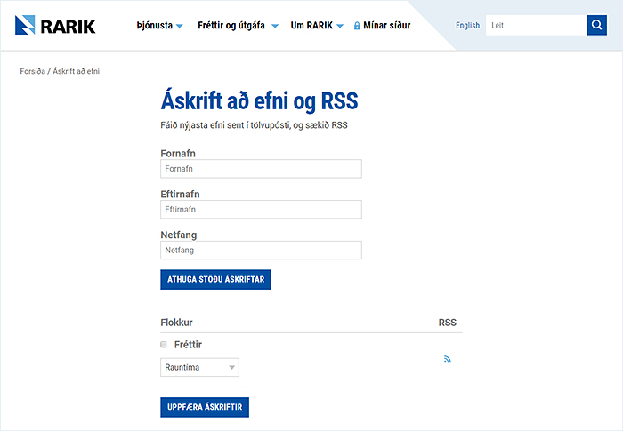
We already mentioned the Home Page Alerts which were implemented as an automated API which pulls in the information in real time. We also implemented a weekly update solution for the RARIK Staff Directory - which handles fairly frequent inter-office moves.
RARIK makes use of a lot of graphs and table-based content, and we had to upgrade the HighCharts functionality to work fully responsively - this is likely to be revisited and streamlined as a phase 2. We also assisted with some custom CSS and JavaScript to enable versatile display of large tables across different devices and breakpoints. A custom presentation style was originated for optimising table display, as well as a slightly adapted in-article document download display:
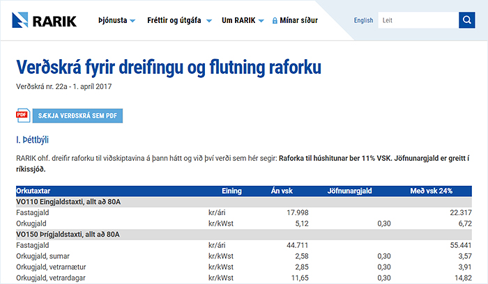
At the 11th hour a new workflow requirement was identified, which required the resuscitation of the soon-to-be deprecated stand-alone Affino documents module (which has been replace by the Media Library). We were able to harness and clone the core functionality and database structure and re-work the display-side code to the new responsive framework.
The project turned out to be fairly fluid - with numerous change request and tweaks arising as we rolled-out and tested the various interfaces. There were a number of instances where additional complexities were discovered within hidden business workflows - all these elements added to the timeline. But in the end it seems to have all been worth it, as we would not have such a solid solution in place had we not had to brainstorm all those scenarios and engage due diligence to find clever solutions.
The RARIK site also makes use of a custom Google Site Search which already works well with inflected Icelandic vocabulary, and saved considerable effort in not having to write all those permutations into the Affino core. That said, Google is in the process of changing its corporate search offerings so this will likely need to be revisited in the near future. Hopefully there will be some more homegrown alternatives by then.
Success
So the project took slightly longer than intended, but that is kind of to be expected with all the twists and turns that happened along the way. The additional needs for compliance and meeting government standards and regulations also required an extra level of due diligence when compared to the commercial sector. The new site was built in parallel and on the same licence as the existing site, but as an all-new Zone. In fact the whole thing went live just yesterday.
The transition went off remarkably smoothly, and the new site was up with the minimum of fuss - with the entire process taking no more than a couple of minutes. As with all work of this nature there were some last minute snags which were quickly resolved.
It all seems to work well across all the main browsers and across all the different devices and breakpoints. There are still a couple of technical and search-engine-related matters to sort, but it's all looking a whole lot better than what it replaced. Hopefully the customers will like and engage with the refreshed approach as much as the RARIK site committee does.

Did you find this content useful?
Thank you for your input
Thank you for your feedback
Upcoming and Former Events
Affino Innovation Briefing 2024
Webinar - Introduction to Affino's Expert AI Solutions - Session #2
Webinar - Introduction to Affino's Expert AI Solutions - Session #1
PPA Independent Publisher Conference and Awards 2023
Driving business at some of the world's most forward thinking companies
Meetings:
Google Meet and Zoom
Venue:
Soho House, Soho Works +
Registered Office:
55 Bathurst Mews
London, UK
W2 2SB
© Affino 2025
