Bathrooms and Showers Direct Refreshes and Reinvigorates its Digital Presence with Affino
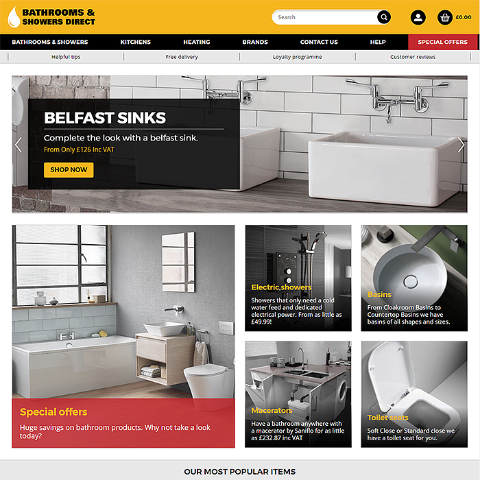
We’ve been working with Bathrooms and Showers Direct (BASD) for nigh on a decade now and have had to handle a variety of challenges together over the years, in particular the complexities of the integration with Google Base / Google Merchant Centre which is an ongoing project with Google’s consistently evolving approach.
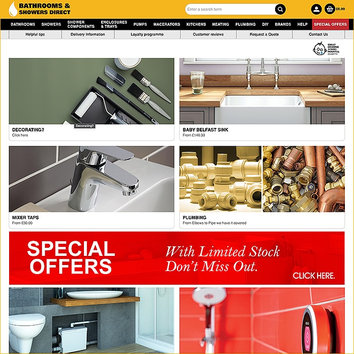
BASD is something of a special case in that it targets and serves both the trade, as well as domestic customers through the same ecommerce website, i.e. both B2B and B2C simultaneously. It’s always been tricky to strike the right balance in design and layout to highlight the high quality of the brands carried without alienating the trade, or too industrial to lack proper consumer appeal.
A great part of BASD’s business involves SEO and PPC campaigning with targeted terms. So there is an inherent complexity here not commonly faced by many retailers. BASD also had over a hundred specialised product searches to cover the 10,000’s of products for sale. This had lead to a complex structure of product pages navigation and then an entirely separate product search structure.
Both sides were aware of the need to move to responsive design, because of the greater SEO weight carried by that functionality, and indeed the general growth statistics in retail site use, which are still trending toward most of the growth coming from mobile devices.
As touched on earlier, one of the key considerations was striking the right balance in the look and feel, layout and re-organisation of the site.
Collaboration
Affino very much worked alongside BASD to get the design up to the required format - that is to say a look and feel which appealed to both trade and general consumers. We tend to be quite consumer-led at Affino, so it was a touch tricky to find exactly the right level, which we believe was achieved in the end, but not without a lot of finessing and going back to the drawing board along the way.
There was also a considerable exercise required for reorganising the structure of the catalogue, and optimising the key navigational elements - all of which came together over a fairly extended period of iteration.
Key within this process was to produce something that was relatively easily replicable and manageable - so getting the right structure, layouts, picture formats etc. was essential both from a fit-and-finish quality point of view, as well as from a manageability and productivity viewpoint - the whole thing needed to be relatively easily workable.
We audited the site’s current function and identified several areas that could do with improvements. In fact as we are still transitioning from Classic to full Responsive Affino, there were still some incumbent components and elements that needed to be reworked and updated for the new site.
Solution
A large part of this project consisted of two critical phases - the site re-structure and re-organisation, and the actual final designs and layout, both of which went through several rounds of iterations and refinements along the way. Crucially, we have been able to remove nearly half of the site structure by combining the product listings with the product searches, essentially allowing every product listing page to be it’s own dedicated search page.
The incredible thing here is that the site uses all core components - admittedly some of the ecommerce-relevant ones had to be specifically updated for this site, but those elements were already on the roadmap. This included some enhancements to Related Products / Recommendations as well as an enhanced Product Search in responsive, along with the new My Account screens.
Other smart enhancements came with the new Article Feature Scroller which allows BASD to showcase the most important deals and introduce new products and brands beautifully. Also important has been the greatly improved ways the team can now create and present content, including the new responsive FAQ template and the flexibility afforded by article steps.
The final piece to be put into place for the launch phase was making prices ’sticky’ on mobile, so consumers would always have the cost in the frame when making their purchasing decisions.
A follow-up phase has already been planned for when the existing Checkout Channel will be replaced by an entirely re-written responsive-optimised version
Success
The focus of these latest updates was to make the site function really well on mobile, and to introduce the new combined product / search pages, and that’s where we encourage you to check it out. By combining the product searches and catalogue into one we also transformed how the BASD team can now manage their site.
It’s critical to note that sites that rely on SEO and PPC really must be SSL-encrypted and running on mobile-optimised responsive design platforms - for those are the criteria that Google and Bing use to measure the worth and value of your pages - your products and goods.
Considerable praise must go to JD who handled so many of the more arduous and fiddly tasks, yet stuck to the mission throughout the project to ensure that everything ended up in the right place. The step up in quality is wholly apparent from the moment you hit the Home Page.

Did you find this content useful?
Thank you for your input
Thank you for your feedback
Upcoming and Former Events
Affino Innovation Briefing 2024
Webinar - Introduction to Affino's Expert AI Solutions - Session #2
Webinar - Introduction to Affino's Expert AI Solutions - Session #1
PPA Independent Publisher Conference and Awards 2023
Driving business at some of the world's most forward thinking companies
Meetings:
Google Meet and Zoom
Venue:
Soho House, Soho Works +
Registered Office:
55 Bathurst Mews
London, UK
W2 2SB
© Affino 2025

