Customer Experience Management - Providing a Better Customer Journey
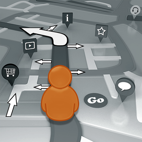
During my visit to Internet World last Wednesday, I noted that a number of companies had their own angle on ’Customer Experience Management’. Recent empirical evidence shows that customers no longer make linear journeys through websites or the Internet as a whole. I myself am a tangential interlaced-browsing aficionado who thinks nothing of popping open another browser window and exploring frequently obtuse or out of the ordinary avenues.
My thoughts veer towards motorcar travel - with GPS assistance of course, and a variety of roadside signage, and how a journey by road is impacted by various major junctions (landing pages) and complex road networks (sitemap). Most people use some form of route planning, with numerous different options and pathways available through the same areas.
With the onset of responsive sites, sticky navigation or heads-up dashboards are very much in favour - much like the modern motorcar dashboards - hovering continuously within eye-line - and providing the journeyman with all necessary tools within easy reach. In terms of user journeys through a website, there are multiple points of entry, as well as multiple points of navigation and exit. The earliest websites which consisted of static fixed hierarchy content are very much a thing of the past. Modern websites use personalisation, multi-display, topic-tagging and user perspectives to present individual customers with very different content on the same URL screen - or even the same content on different URLs!
There are very few linear journeys taken these days, so you cannot really expect a customer to necessarily follow a pre-set sequence. Instead, you need to use sales and marketing automation (Customer Ladder/ Conversion Events in Affino) to monitor and prompt customers and notify admin / support staff when a user journeys to or stalls at a particular junction of the site. At the same time you need various ’sticky’ tools, as well as navigation to always stay visible on the screen no matter where a customer journeys to. These include shopping basket, help chat and user’s clipboard / wishlist. Like I said previously, most new sites have sticky navigation which allows customers to access any point of the site at any time. Right on the page / screen though you also need to have obvious Calls to Action, help buttons and prompts for next steps - the most typical of these is prompting users to read or view one of the most recent or popular posts on the site. When building a website we always have the motto of ’No dead-ends’ - no matter where you are on the site, there should be obvious and relevant links / navigation to related content and activities - in order to maintain the flow of the journey and maximise a customer’s experience of the site.
For the ultimate customer journey - we’re talking about two dashboards in effect - one which serves the site owners - key navigation, signposts and calls to action; and one which serves the customer - utilities dashboard with bookmarks etc. To create a better journey mechanism you open out various routes of passage through to the same content and the same eventual endpoint - subscription, registration, inquiry, participation, feedback, purchase etc. You can reward customers with points and financial credits for their participation on your site - for instance when posting reviews. Competitions can also be used to encourage customers to visit less-frequented parts of the site to get answers to some of the competition questions. In short, you set up a series of rewards for onsite activities. Customers like nothing more than openness and transparency - so that you make the rewards and recognitions on the site accountable to the community.
The better experience comes from the sticky, always-on navigation and help utilities, multiple routes and rewards and recognition. For the site owners, the ’Customer Experience Management’ is how you monitor the customer journeys and what triggers you set up for different activities. No amount of stats monitoring can replace smart, automated functions. So you set up a trigger to initiate / prompt ’do you need help’ on help chat if customer has spent more than 10 minutes in checkout. Same if the customer reads a number of articles on the same topic - they’re obviously interested in something you have to offer. As with shop staff, the trick is to monitor and offer assistance without being intrusive. I myself like to be left alone in shops until I ask for help - I don’t mind a friendly greeting - but don’t offer me help if I don’t request it. This is where websites need to get smarter on handling different types of customers. A novice customer is likely to need help right away, while a more experienced customer likes to browse uninterrupted until they’re ready to make some sort of executive decision - at which time they may require some assistance.
Advanced Social Commerce platforms like Affino, have built-in sales and marketing automation - which triggers a variety of secondary activities based on any and every user activity. Over time, you can fine-tune the responses and identify different customer types and how each group likes to be dealt with. This kind of sales and marketing automation is key for when daytime support staff are no longer around. For customers browsing a site out of office hours, the automation needs to be able to ’handle’ and fully manage the customer experience without human involvement / intervention. This is where the more advanced systems really earn their keep by automating all the key responses to a customer’s likely activities / needs.
In the latest version of Affino we have Conversion Funnels - which allow you to daisy-chain together a series of interrelated trigger events to monitor the overall outcome of a particular marketing / sales initiative - tracking customers from outbound mailing through to every single action and activity onsite - and seeing where and how they might fall out of the process. I suppose the longer-term trend is to build in some sort of artificial intelligence in how the automation reacts to different customer types based on learned experiences. For now, the skill is in the setup - in identifying likely patterns of behaviour and setting out the appropriate trigger points to capture and capitalise on that behaviour.

Did you find this content useful?
Thank you for your input
Thank you for your feedback
Upcoming and Former Events
Affino Innovation Briefing 2024
Webinar - Introduction to Affino's Expert AI Solutions - Session #2
Webinar - Introduction to Affino's Expert AI Solutions - Session #1
PPA Independent Publisher Conference and Awards 2023
Meetings:
Google Meet and Zoom
Venue:
Soho House, Soho Works +
Registered Office:
55 Bathurst Mews
London, UK
W2 2SB
© Affino 2024
