The 4 Pillars of Brand
There’s over a billion websites in the world, shared by near enough 3 billion internet / digital media users - whether on desktop, laptop, tablet or smartphone. With such an incredible mass of properties, it is more important than ever to be able to stand out from the crowd. The transition to responsive design imposes certain limits on the framework of your interface, which means that your Logo / Brand-look-and-feel becomes more significant than ever before.
We see far too many sites / interfaces where any old logo could be superimposed / slotted into the top bar - the site look-and-feel is so homogenised, it could be for almost anyone. The challenge is to infuse the brand and its relevant assets with the right personality to appeal to its target audience. Lots of companies have great names, but their logos are weak and lack impact and personality. For many of those with strong logos, there is insufficient positioning to gain traction with and influence the customers, or the perception is not quite right to encourage easy adoption.
In the best cases, a brand / logo carries a story / narrative with it and a number of intangible influencers by way of inherent brand values. It is a designer’s mission to imbue whatever asset they are designing - with the correct associated values. When I talk about logo / brand design, I always talk within the framework of Unique, Relevant, Meaningful and Memorable - in terms of the core function of a logo. I also reference what I call ’Brand Echoes’ which are graphic devices used to subliminally reflect and recall the logo within applied design - in essence to immediately connect the design interface / packaging back to the brand. An example of this might be a packaging box, which does not usually have a logo on every facet, but uses colours, symbols and graphic effects - swooshes, curves, lines etc. to remind the user / viewer of which brand they are dealing with. So is the case too with digital interfaces which mostly now are fading into a much of a muchness anonymity. There are far too many sites with accents of corporate blue and fire-engine red. To differentiate and distinguish yourself, not only must the logo convey personality and a unique point of difference, but so really should the design around it.
The difficulty is usually what you have to work with - i.e. limited brand guidelines and limited, samey colour palettes. It’s a little bit like contemporary pop music composition where all the obvious melodies have already been produced. You need to come out with new combinations and variations. In cuisine it is very much the same scenario - we are all now very familiar with all the key international cuisines, so the trend for the last many years has been toward fusion - cleverly combining different cuisines, cooking methods, flavours and textures.
Near enough every symbol has been used in some way, so you much come up with clever evolutions or version of these - along the fusion lines. One of the most difficult exercises in modern branding is to come up with a unique name, for which a top level domain is still available (at reasonable cost). You have the choice of creating an entirely new phonetic fusion - a la flickr and tumblr, or using multi-lettered longer words for which someone has already registered every domain variant.
I gave single out 4 prinicples constructs for a brand, which I call the 4 Pillars, forming the acronym NIPP. The terms are pretty self explanatory, but I will include some useful notes on each below.
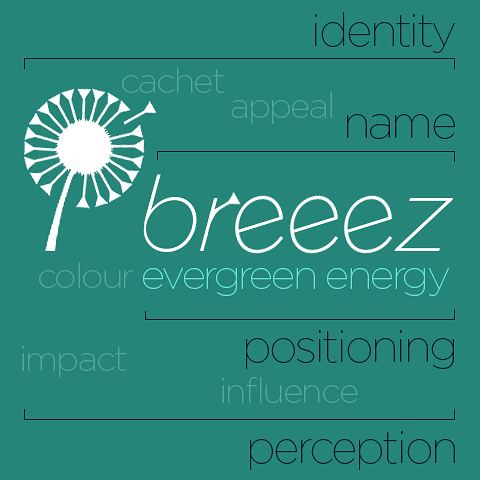
I created the ’Breeez’ logo above purely as a reference example - the shape of a dandelion seed head really appealed to me, but the logo / ident could be served by a number of similarly meaningful symbols - like a pinwheel.
Name
(Company / Brand Name)
Very difficult these days to create a unique meaningful name from scratch - as all the obvious ones were taken quite a while ago. A good name can make all the difference for SEO, and for introduction / initial customer traction. When lining up with ideal domain, you usually have the option of a phonetic fusion name with added or missing letters, or a more literal but much longer name. I have a penchant for creating names as short as possible - for easy pick-up - usually aiming for no more than 7 letters if I can. In the above example, I have created the fictional wind energy company ’Breeez’ with three e’s!
Identity
(Logo = Shape / Symbol Ident + Typography + Colour)
The Identity is the combination of symbol / ident and typeface. I personally like logos which use both symbol and text, as you can apply them much more cleverly on different brand / marketing assets - and they mean much more than simply stylised text alone. I don’t usually like logos where letters within the word are made into symbols, but there are some good examples of this. An ident / symbol makes it much easier for the Designer to evolve useful brand echoes within the design. In my above example I liked the single fly-way dandelion seed / seed head motif, as I felt it a clever visual metaphor for breeze, or at least the result of a breeze. I could have used a variety of other pertinent symbols too - like a pinwheel, but the plant motif ties in nicely with the strapline - evergreen energy.
Positioning
(Strapline / Differential)
Prada just says Since 1913 - indicating long-term heritage, Nike is now in the position to say ’Just Do It’, but when you’re starting off, you really just need to define what you are about, and what makes you different. I could have written ’green energy’, but ’evergreen energy’ is more clever - hints at even more environmentally friendly renewable energy. With Positioning straplines you usually start by just introducing yourself, next you evolve to a strapline of comparative difference, and the end state is the aspirational lifestyle strapline of brands like Nike and L’Oreal (Because I’m Worth It).
Perception
(How a Brand is viewed by its target audience - immediate associations, provenance, pedigree and heritage)
However you set out your stall as it were, you are still exposed to the vagaries of consumer behaviour and interpretation. People will read different things into your brand symbols and messages - it is always a case of trying to please the most relevant / lucrative of your target audiences. You will never ever get 100% approval from everyone. Perception also comes into using known symbols and phrases, which may already be in circulation - this means stamping your own identity and personality on things. Brands carry with them lots of intangibles, the brand building exercise is one which is constantly in progress, you need to keep building momentum. Some things you can deflect or harness, but there is also a degree of weathering the storm and waiting for nature to take its due course. All manner of things can be mitigated via clever brand strategy and design, but no matter what you do, you cannot please everybody al the time ...

Did you find this content useful?
Thank you for your input
Thank you for your feedback
Upcoming and Former Events
Affino Innovation Briefing 2024
Webinar - Introduction to Affino's Expert AI Solutions - Session #2
Webinar - Introduction to Affino's Expert AI Solutions - Session #1
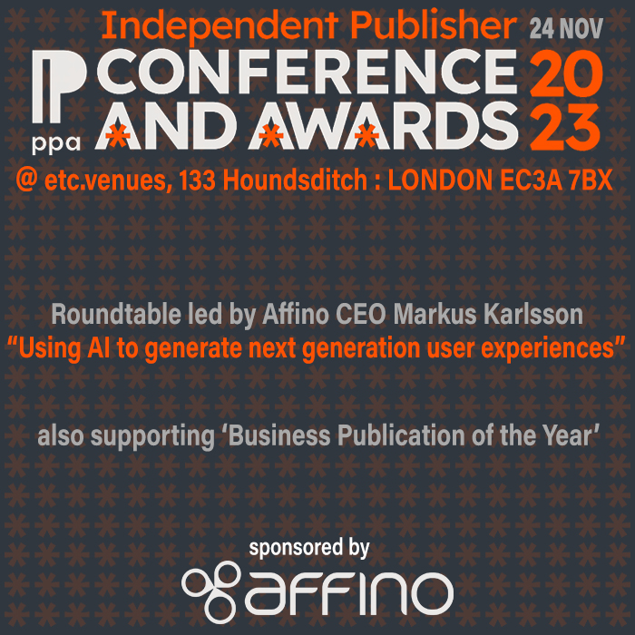
PPA Independent Publisher Conference and Awards 2023
Meetings:
Google Meet and Zoom
Venue:
Soho House, Soho Works +
Registered Office:
55 Bathurst Mews
London, UK
W2 2SB
© Affino 2024
